Responsive Website
Overview
User Research
Design
Usability Studies
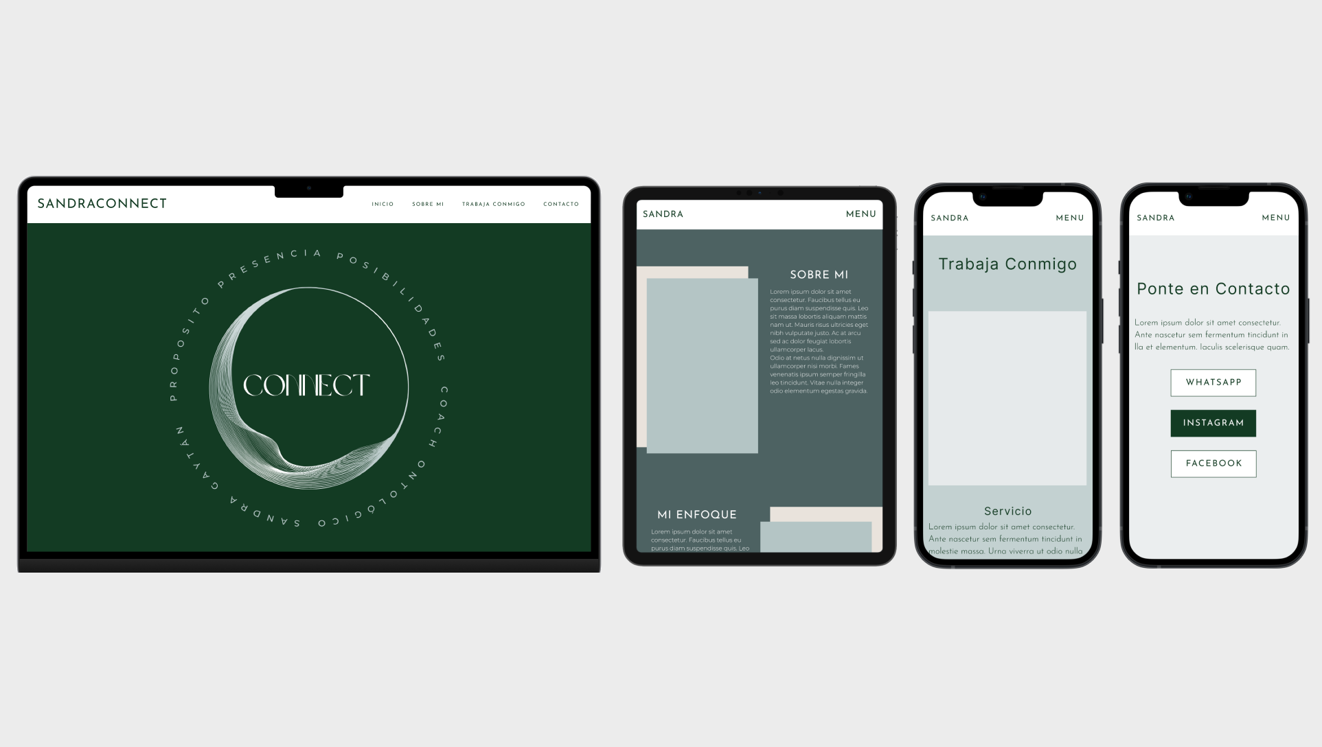
The Life Coach website, is a responsive website aimed at evoking a sense of tranquility, presence, and belonging. A place where you can find a guiding hand to help you through all of life's problems .
The client and users are a part of the next billion users with minimal internet knowledge.
Design a responsive website for the next billion users- those who are just coming onto the internet. Making sure the design is user friendly, clean, inclusive, and culturally relevant. Alongside, assisting the client with their product and brand development by guiding them through the brainstorming, ideation and research phases of product and service design.
Research
Summary
Through the research conducted on users and the competition, it was evident that focusing on a familiar and simple website design would be the best solution for ensuring the intended users - next billion users- would have a smooth experience when navigating the site.
Product
All of the information that was gathered during the product research is consolidated in the competitive audit image below and an analysis of it is presented in the following competitive audit report.
The competitive audit further highlighted the existence of a market gap in the life coach industry, with the gap being a lack of responsive websites with the next billion users in mind.
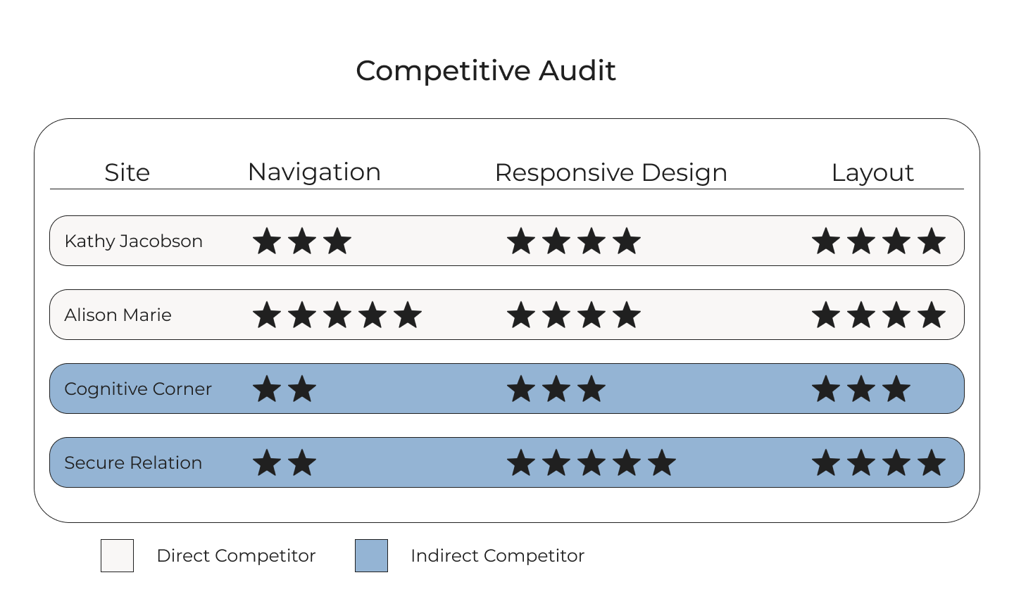
This report identifies the strengths and weaknesses in design and usability, of four life coach websites, in order to identify opportunities for improvement.
Direct: Kathy Jacobson
Direct: Alison Marie
Indirect: Cognitive Corner
Indirect: Secure Relation
Responsive design layout issues.
Accessibility, text over image issues.
Unfamiliar navigation.
Navigation is confusing & unfamiliar.
1. Ensure familiar navigation menu.
2. Ensure contrast & readability in text over images.
3. Ensure responsive transition between screen sizes is smooth.
User
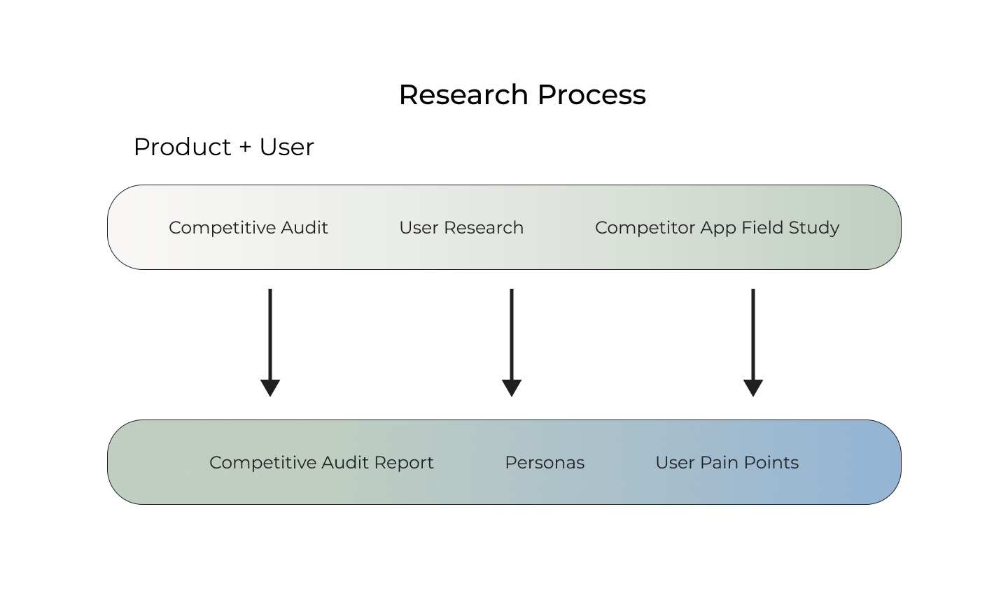
With the assistance of demographic data, user interviews and a competitor app field study -in the form of usability testing- the user research assisted in the creation of personas and user pain points.
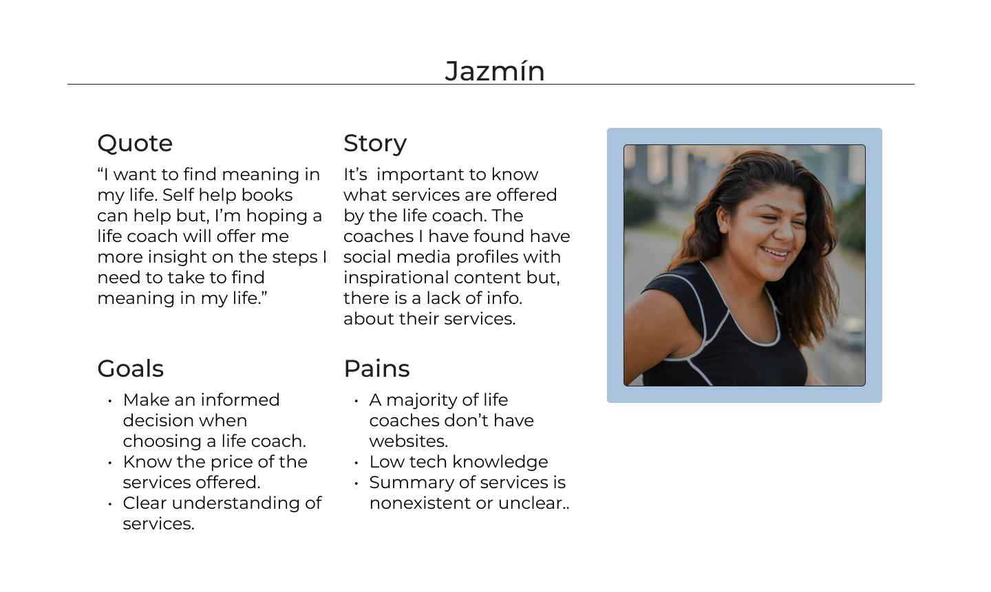
Due to budget and time limitations I opted for the creation of minimalist personas. This minimalist persona approach focuses on a user quote, story, goal, and pains. The latter of which is further explored in the user pain points section following the below persona images.
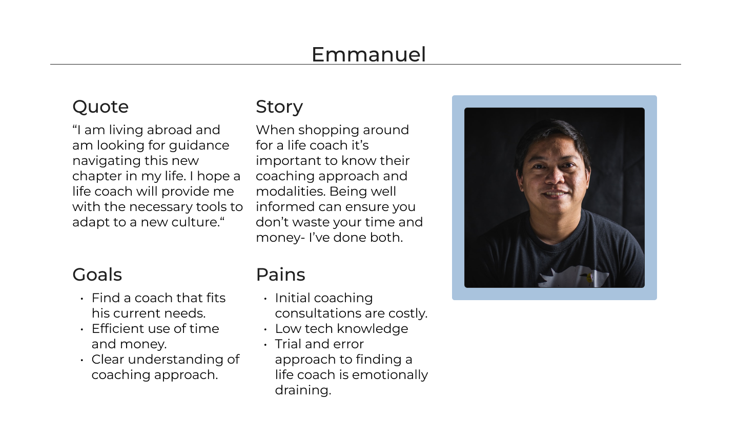
The user pain points were generated by conducting a competitor field study. By gathering information on user interaction while navigating direct and indirect competitor websites the below pain points were observed.
Low Tech Knowledge
Lack of Clear & Concise Information
Lack of Websites
Users were open about their lack of tech knowledge.
Users mentioned that making an informed decision when shopping for a life coach is difficult because they have to rely on a combination of social media and word of mouth to formulate an opinion on the services they offer.
There is an over dependence on social media as the main form of web presence.
Ideation
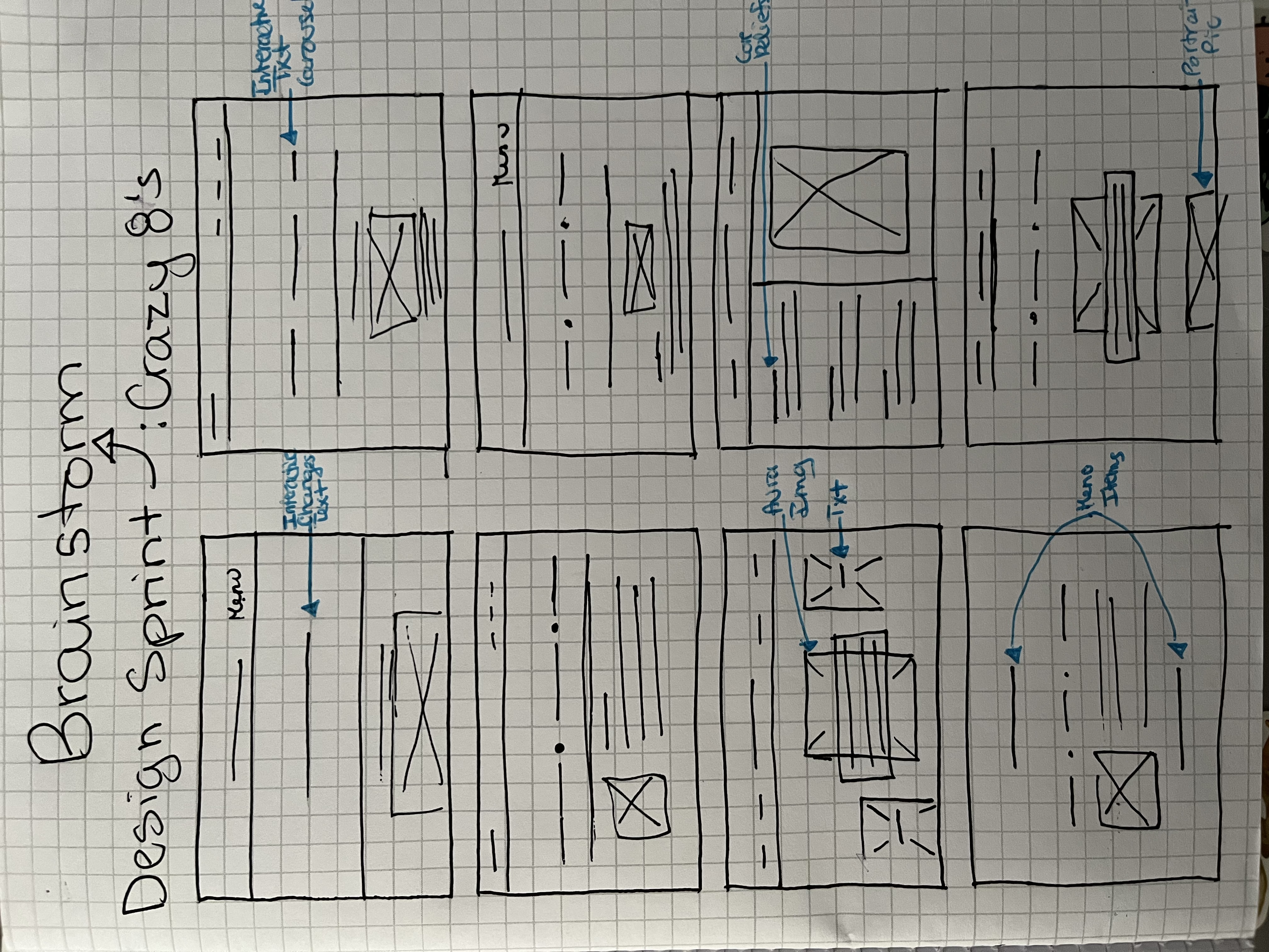
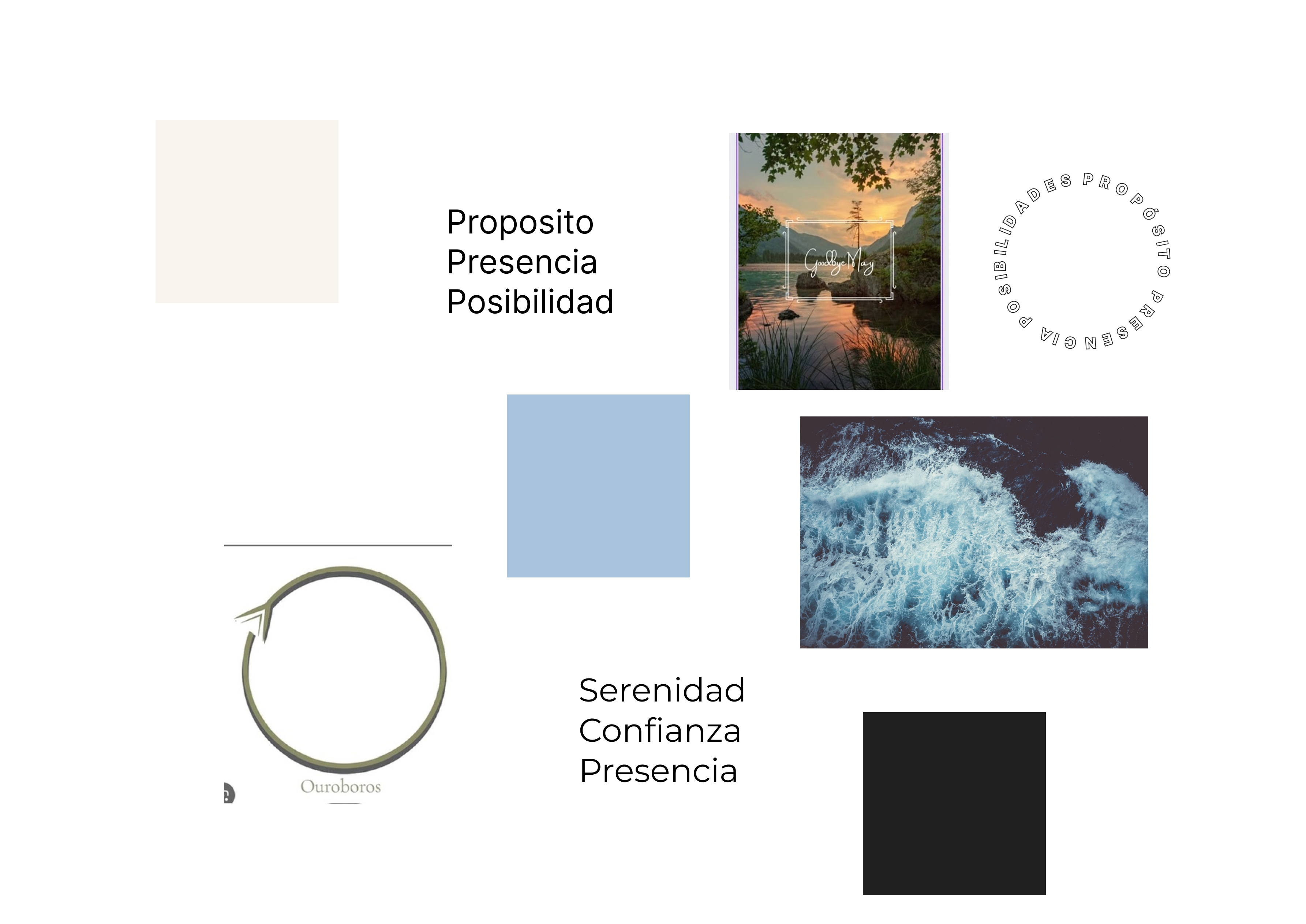
The ideation phase is composes of a crazy 8's exercise and a mood board.
Crazy 8's
The below exercise focuses on the landing page and its menu. This exercise is a great way to get the creativity flowing.
Mood Board
The mood board is simplistic and focuses on three basic elements. These being: color palette, inspirational images shared by the client, and a couple of font examples.
Design & Evaluation
This section covers a significant portion of the case study, since it provides visual examples and design iterations of the product. It is composed of four major sections: wireframes, prototypes, a design review, and design iterations. The outcome being a functional, user friendly design, that represents the clients aesthetic and meets the needs of the next billion users- target user.
Wireframes & Low Fidelity Prototype
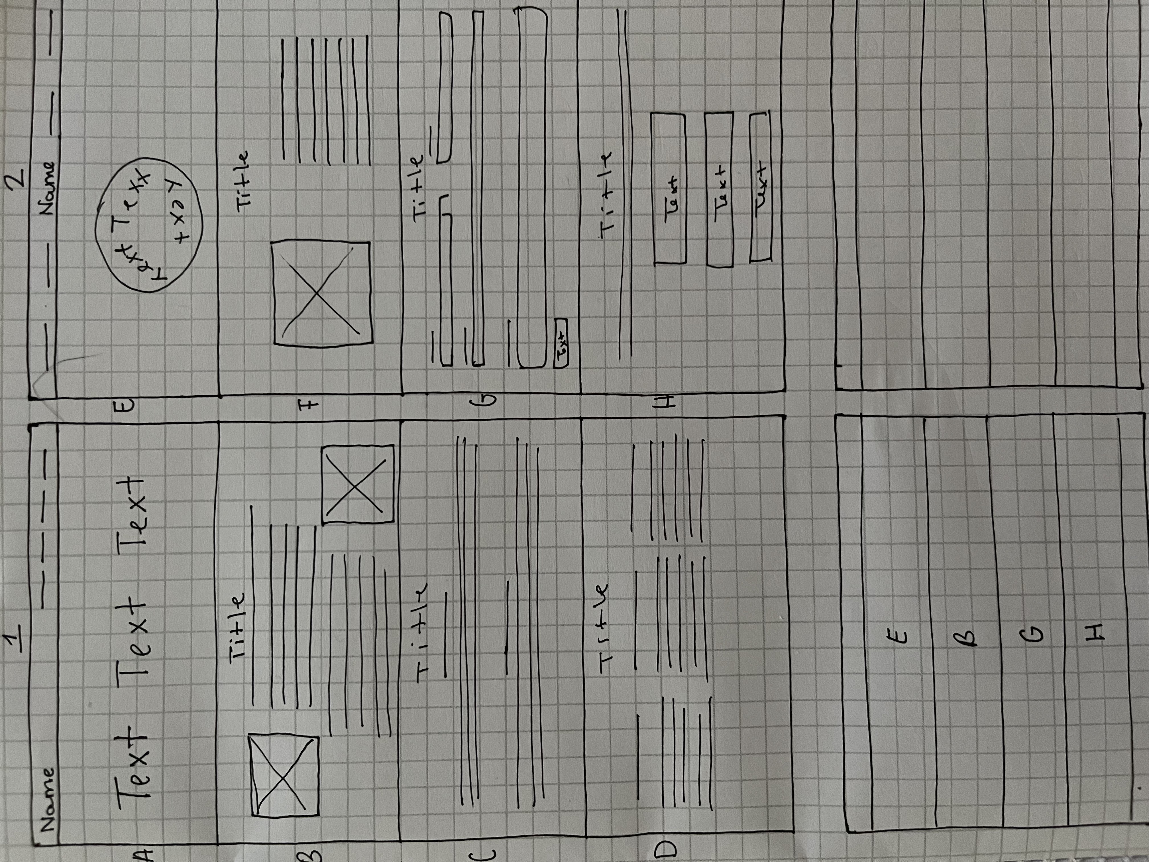
Below you will find a paper wireframe, which serves as a form of brainstorming, followed by a lofi wireframe and it's accompanying prototype.
The wireframe below has a unique approach. At the bottom of the page there is a section that represents a minimized and simplified version of a complete screen. It works similar to a color by number puzzle. Except, in this case the numbers are letters that represent a specific screen layout. There's second screen on the bottom right corner that is intentionally left blank
The below lofi prototype addresses the three user pain points collected from the competitor study conducted in the research phase. These pain points include: low user tech knowledge, lack of clear and concise information, and lack of websites.
The issue of low user tech knowledge was addressed by ensuring the websites layout was generic and therefore familiar. While the lack of information was resolved by ensuring there is a services and about section. The most obvious pain point, a lack of websites, was managed by the entire product creation.
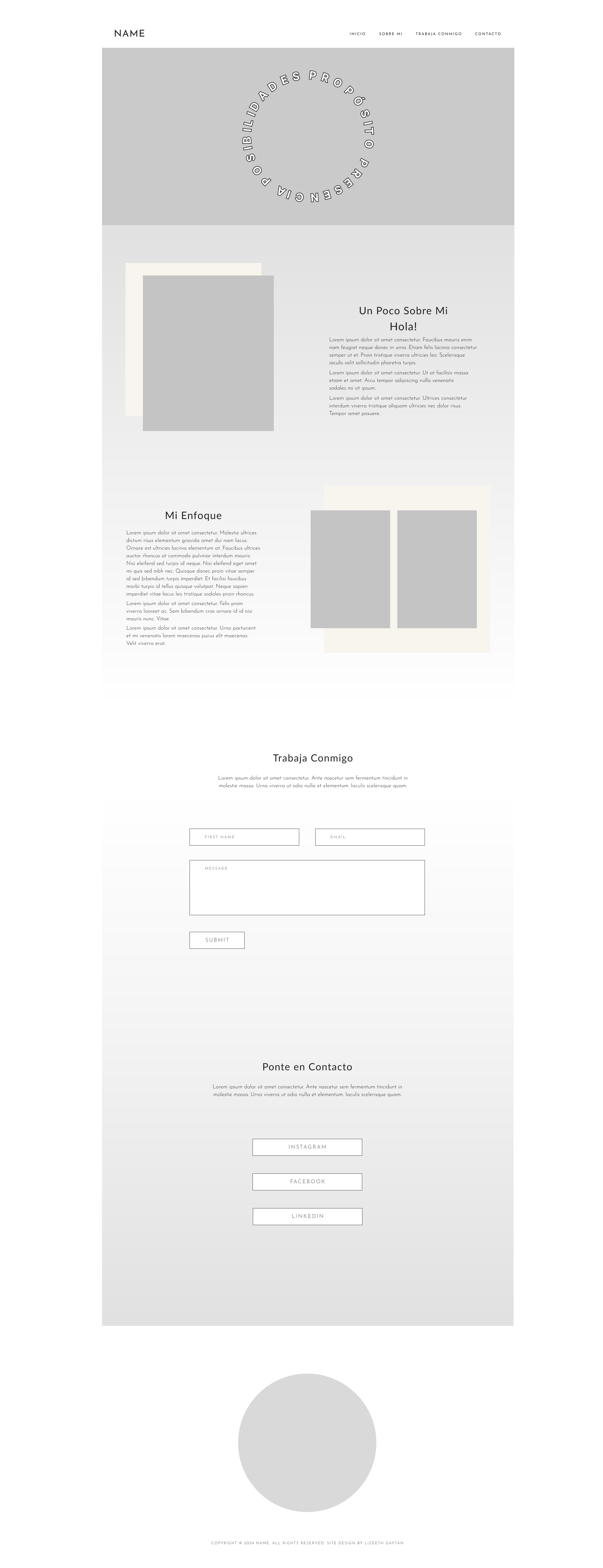 LoFi Prototype in Figma
Design Review
Deviating from tradition this design review follows a very laid back format. Which is expected when the only people involved are the client and designer. One of the goals includes collecting feedback from the client through a collaborative review consisting of an exploration of the design. Giving clients the opportunity to discuss the findings as opposed to simply watching a presentation and critiquing. This laid back design review method borrows from the Ikea hands on approach, which highlights that active client involvement ensures a higher perceived value.
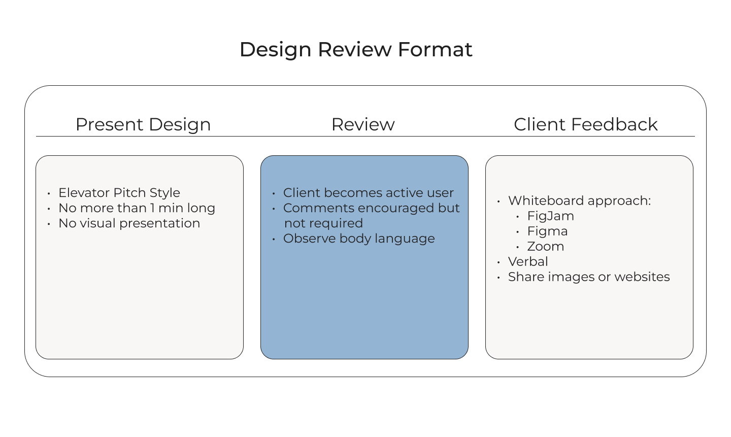
The feedback received from the client during the design review resulted in the following three observations.
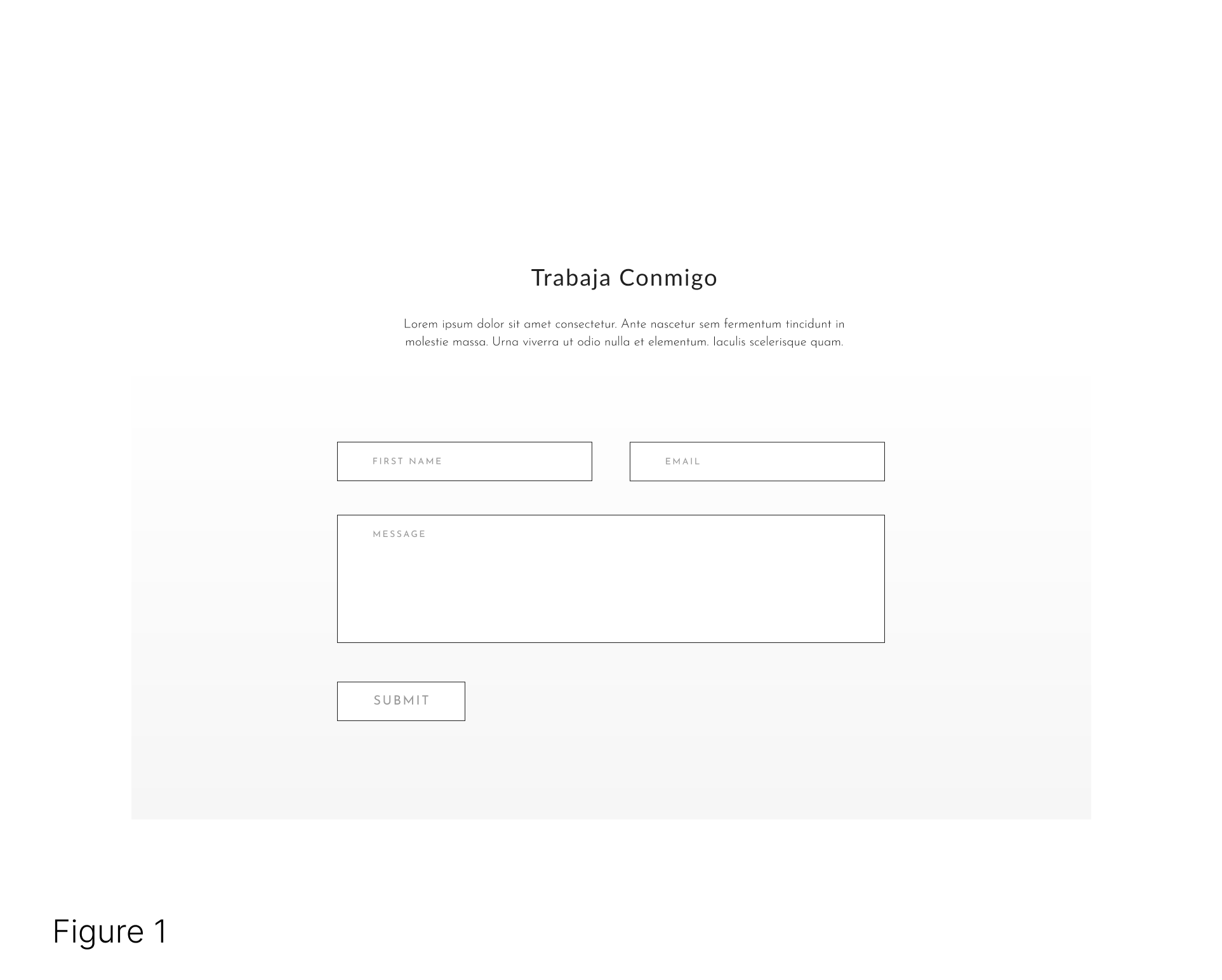
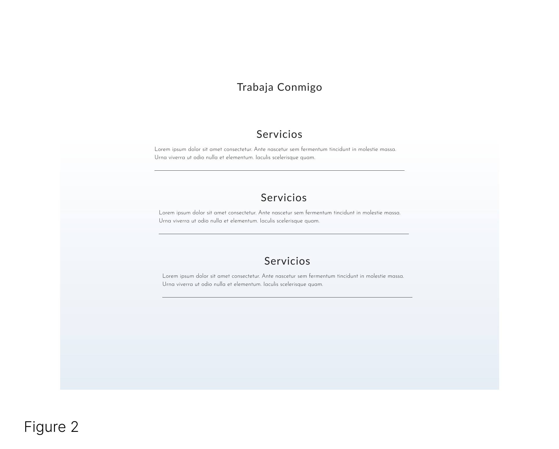
Work with Me: Complete Redesign
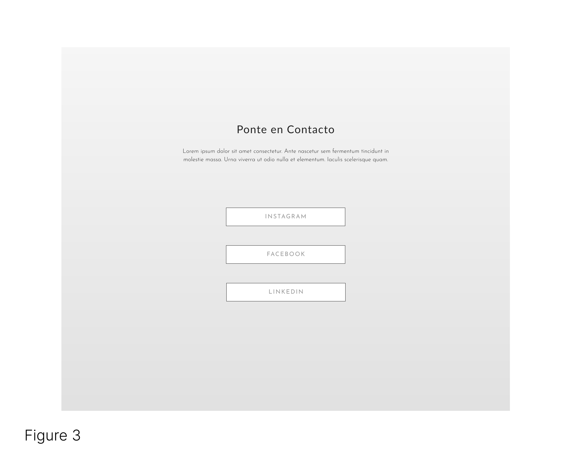
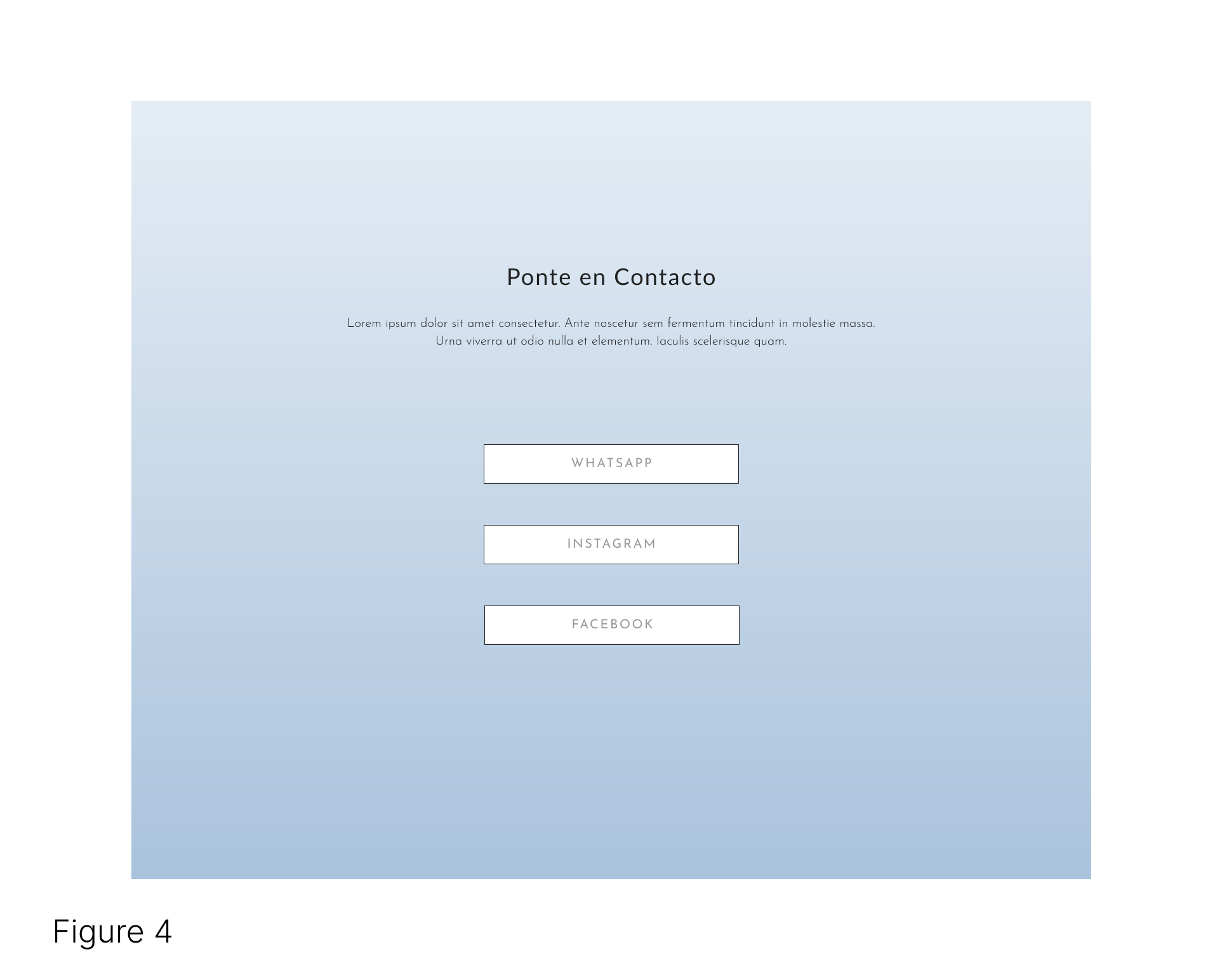
Get in Touch: Change Link Options
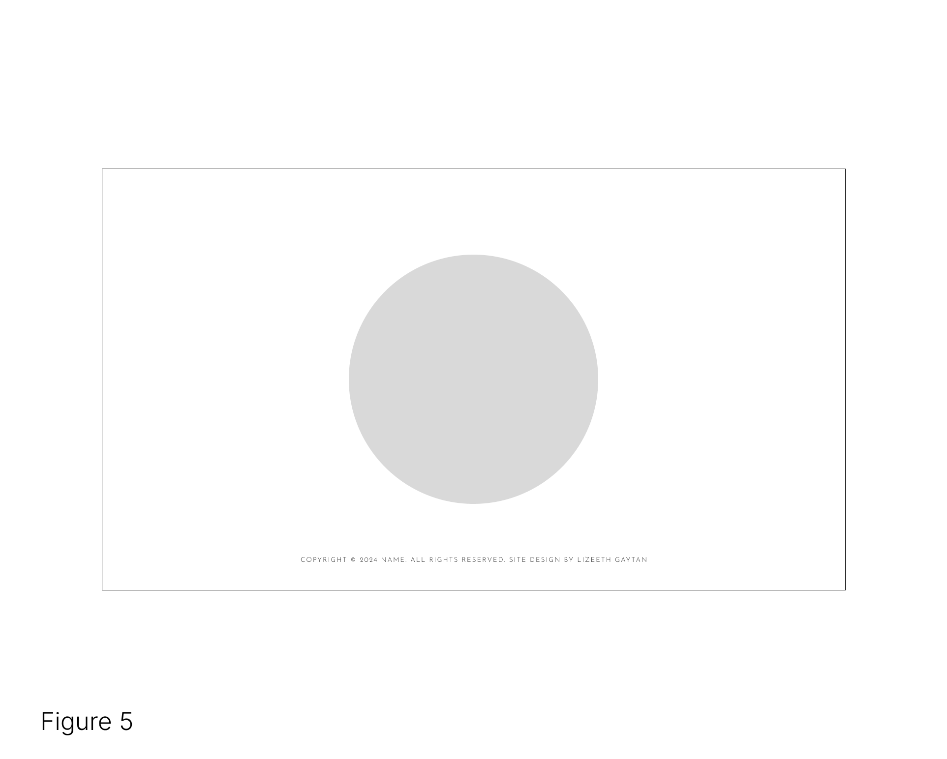
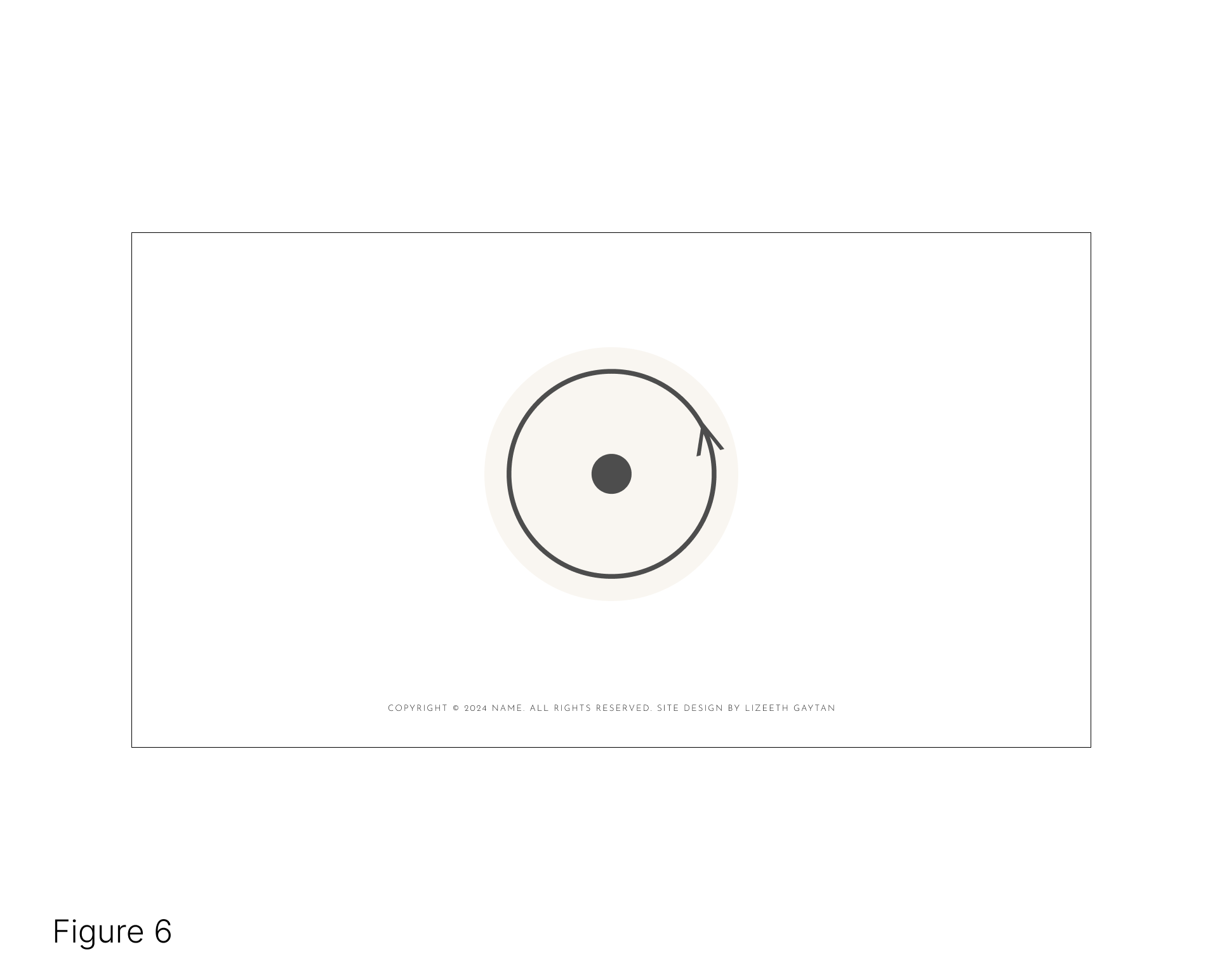
Footer: Reduce Logo Size
The client mentioned they do not plan on using email as a form of communication with their customers. In Latin America WhatsApp is used for most buisness to client communication.
The client mentioned LinkedIn is not a platform they are active in. Piggybacking off of the first finding, it was decided the LinkedIn link would be replaced with WhatsApp.
Client personal vision
Design Iteration
Figure 1, illustrates a form used to get in touch via email but, the client mentioned that email is not their preferred means of communication with their customers. Figure 2 presents a solution to the issue by redesigning the "Work with Me" section to highlight the clients life coach services.
Figure 3 depicts the "Get in Contact" section with links to various social media platforms, one of which- LinkedIn- the client does not use. To fix this issue, the LinkedIn link is replaced with WhatsApp(Figure 4).
Figure 5 illustrates the footer. The issue with this section is simply a suggestion from the client regarding design preference. Figure 6 displays a a simple resizing of the logo, which better reflects the clients vision and aesthetic.
 hifi Phone Prototype in Figma
 hifi Tablet Prototype in Figma
 hifi Website Prototype in Figma
Design Iteration 2
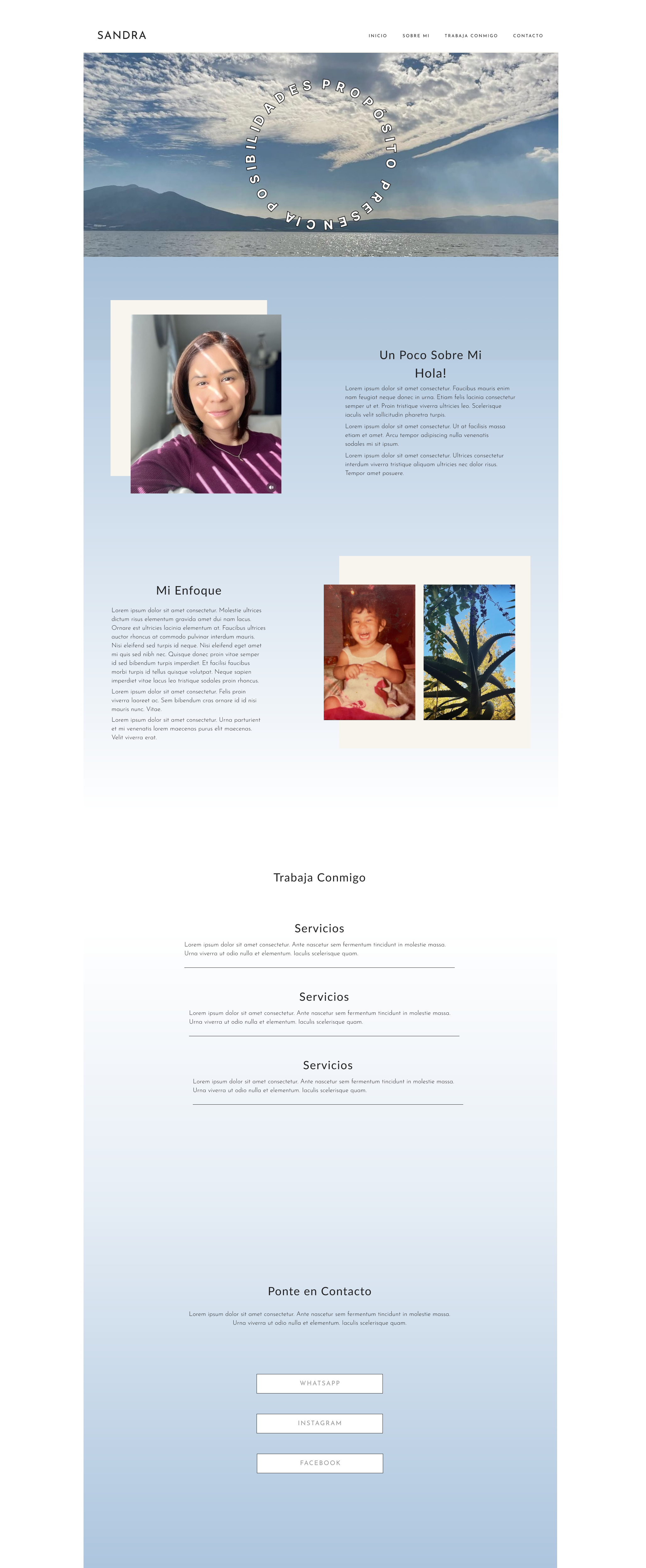
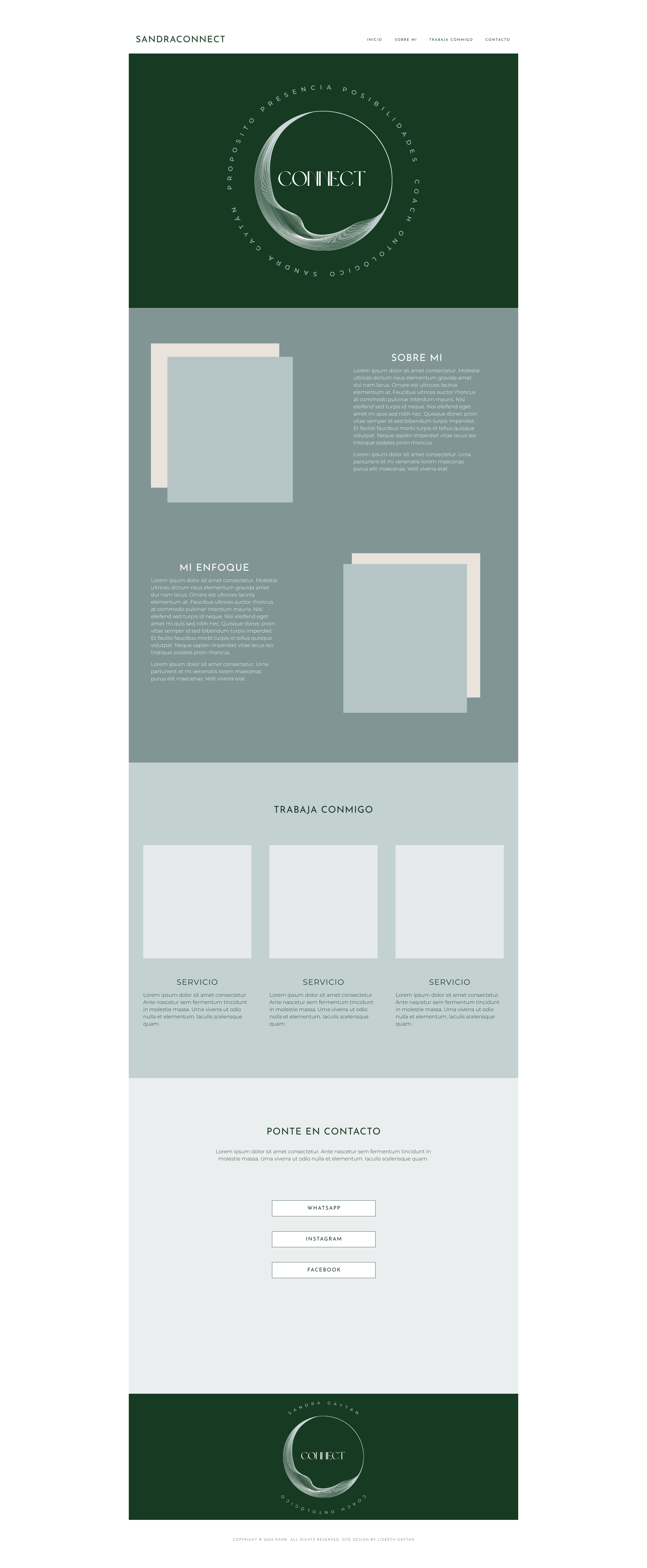
With the clients continued brand exploration in tandem with my direction we decided to delve into a primarily aesthetic rebranding design. Through a couple of brainstorming sessions I helped the client discover a refreshed brand "aesthetic". The design iteration below, reflects the clients desired social media aesthetic. In order to implement a cohesive online presence a new color palette and minor UI changes were made to the design.
Below are side by side images of the redesign in the desktop form. The smaller screen sizes essentially the same and you have the opportunity to view and interact with their respective prototypes in the CONCLUSION section.
Conclusion
Final Product
Next Steps
Move on to the web design phase.
Launch the website.
Website maintenance. Iterating on the design to meet evolving business needs.