Responsive Website
Overview
User Research
Design
Usability Studies
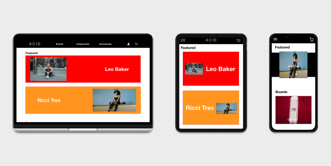
A responsive website, with a streamlined process for building custom skateboards, that fosters diversity and inclusion by showcasing professional skateboarders of diverse backgrounds.
There is a lack of skateboard shops that offer fully online skateboard customization services; alongside a lack of representation, in the field, of people from marginalized groups.
The primary market goal is to ensure ACID skate shop has a competitive edge by delivering a website with features that allow customers to efficiently build a fully customized skateboard. While the social impact goal is to create a space where everyone feels welcomed, regardless of gender, race, sexual orientation, ethnicity or socioeconomic background
Research
Summary
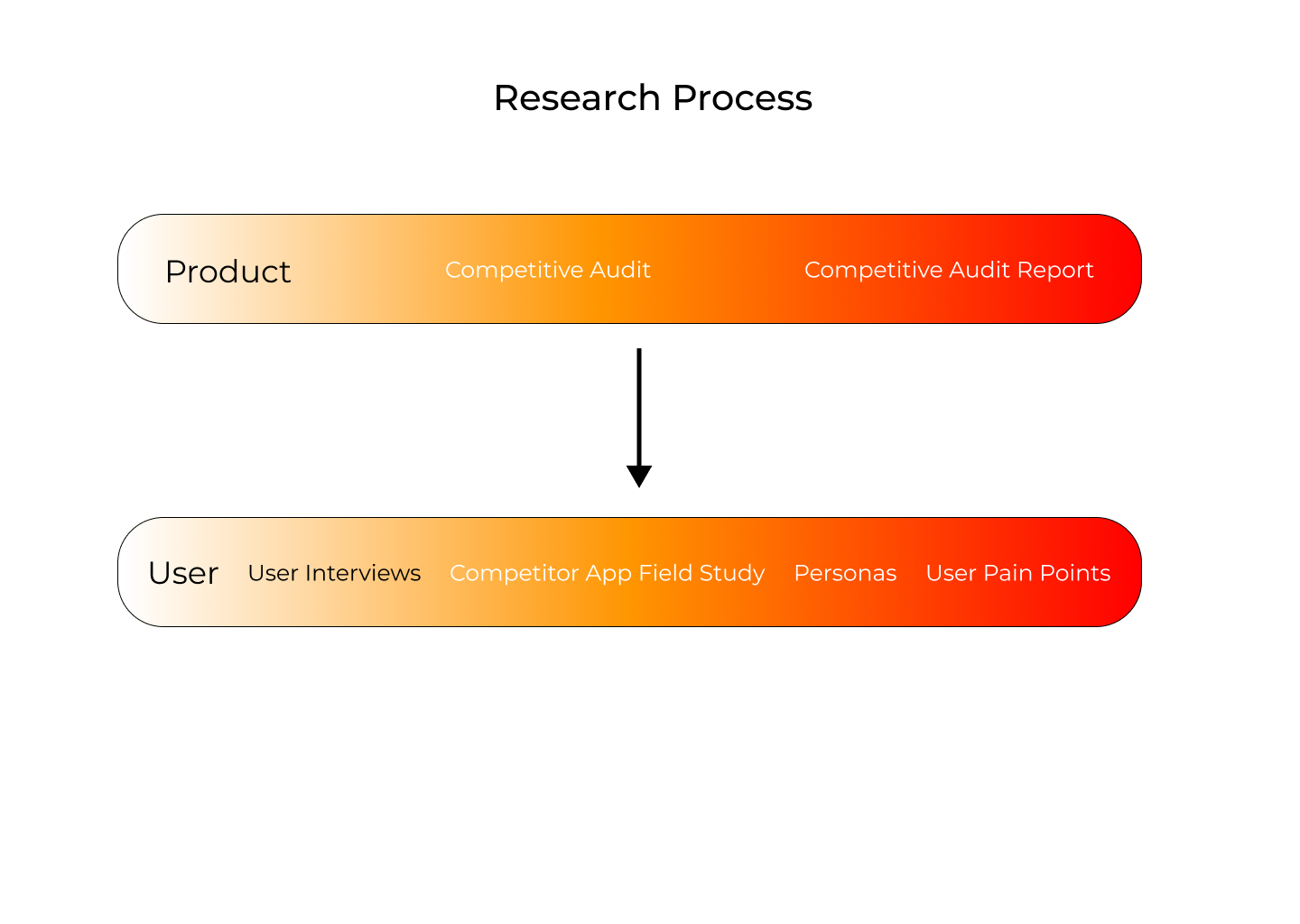
The research conducted for this project is split into two sections one for the product and another for the user. For instance, the product research is composed of a competitive audit and its respective report. While the user research is based on interviews and demographic data. It informed the development of the initial user pain points and the personas. Ultimately, the goal of research is to empathize with users and define product problems.
Product
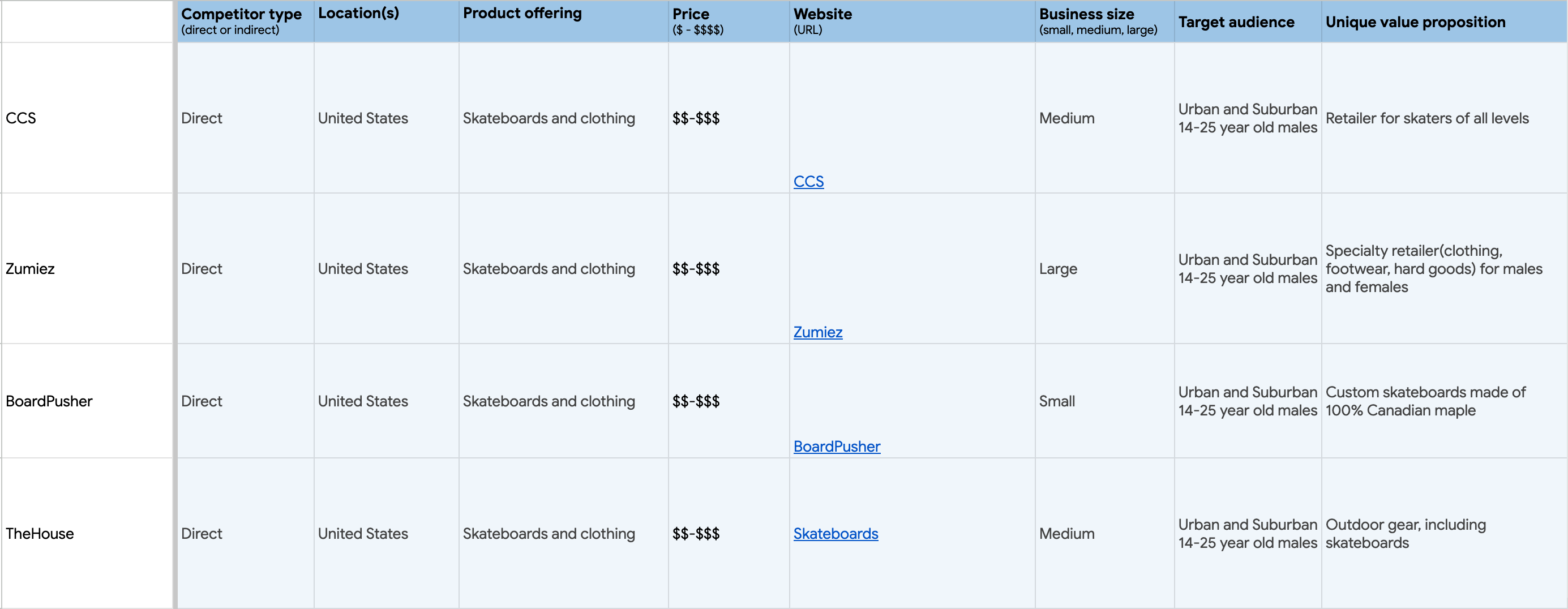
All of the information that was gathered during the product research is consolidated in the competitive audit and an analysis of it is presented in the competitive audit report.
The competitive audit takes into account four direct competitors: one small, two medium, and one large company. Upon analyzing the competitive audit data, three points of growth were identified. The first focused on diversity, the second on the checkout process, and the third on a search feature.
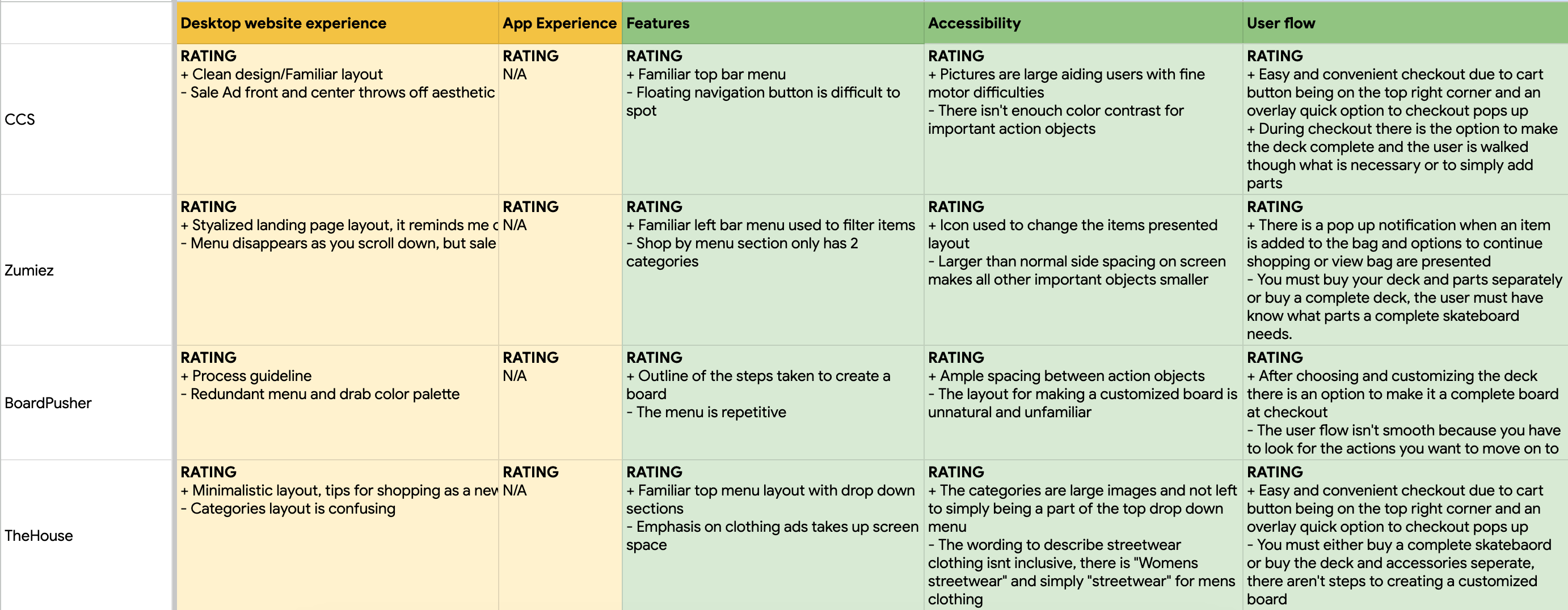
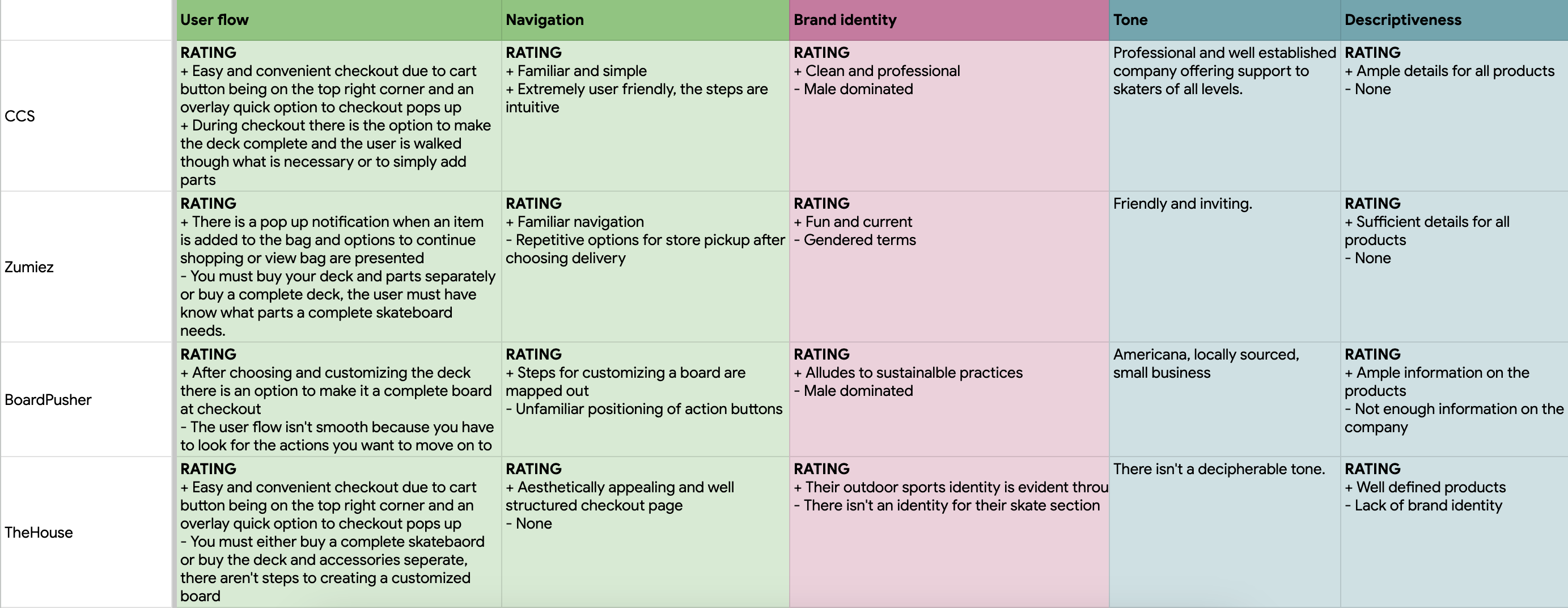
The goal of this report is to identify the strengths and weaknesses in food ordering apps in order to build a product that bridges the gaps present in the industry.
Direct: CCS
Direct: Zumiez
Direct: Board Pusher
Direct: The House
No diversity.
Repetitive options in checkout.
Focus on food trucks.
User flow isn't consistent.
1. Feature to place online orders.
2. Focus on street vendors.
3. Nationwide availability.
User
Ultimately, the analysis of the user research informed the development of the personas and user pain points. It is composed of user demographics, user interviews, and a competitor app field study. The qualitative user data is based on user interviews and demographics information. While quantitative user data was generated from usability testing on competitor apps.
User research findings are summarized as followed. The initial assumptions that primary users value diversity, view gender as highly nuanced, and are between the ages of 14 - 24 was confirmed by research on user demographic. While the competitor app field study revealed that users enjoy fast seamless online payment options and a streamlined product searching process. Some insights gained after analyzing the research include fostering diversity through featured skaters, focusing on unique identities through customizable products that require minimal search effort to create, and offering various online payment options.
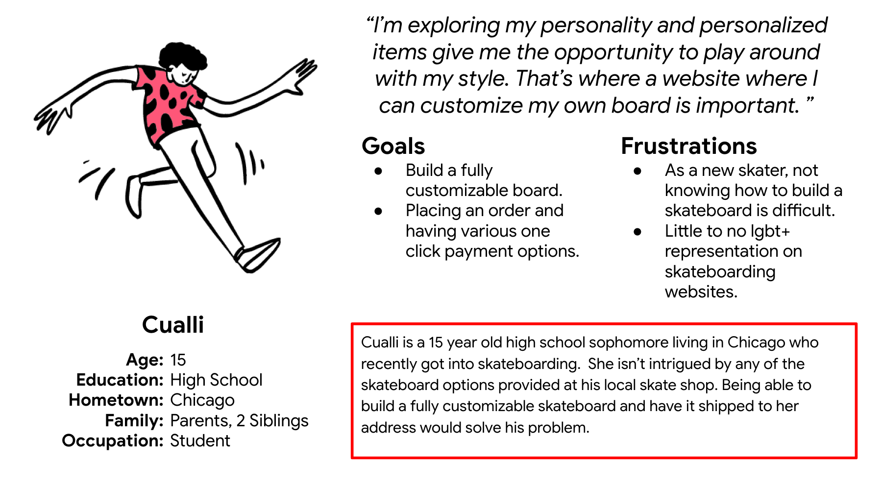
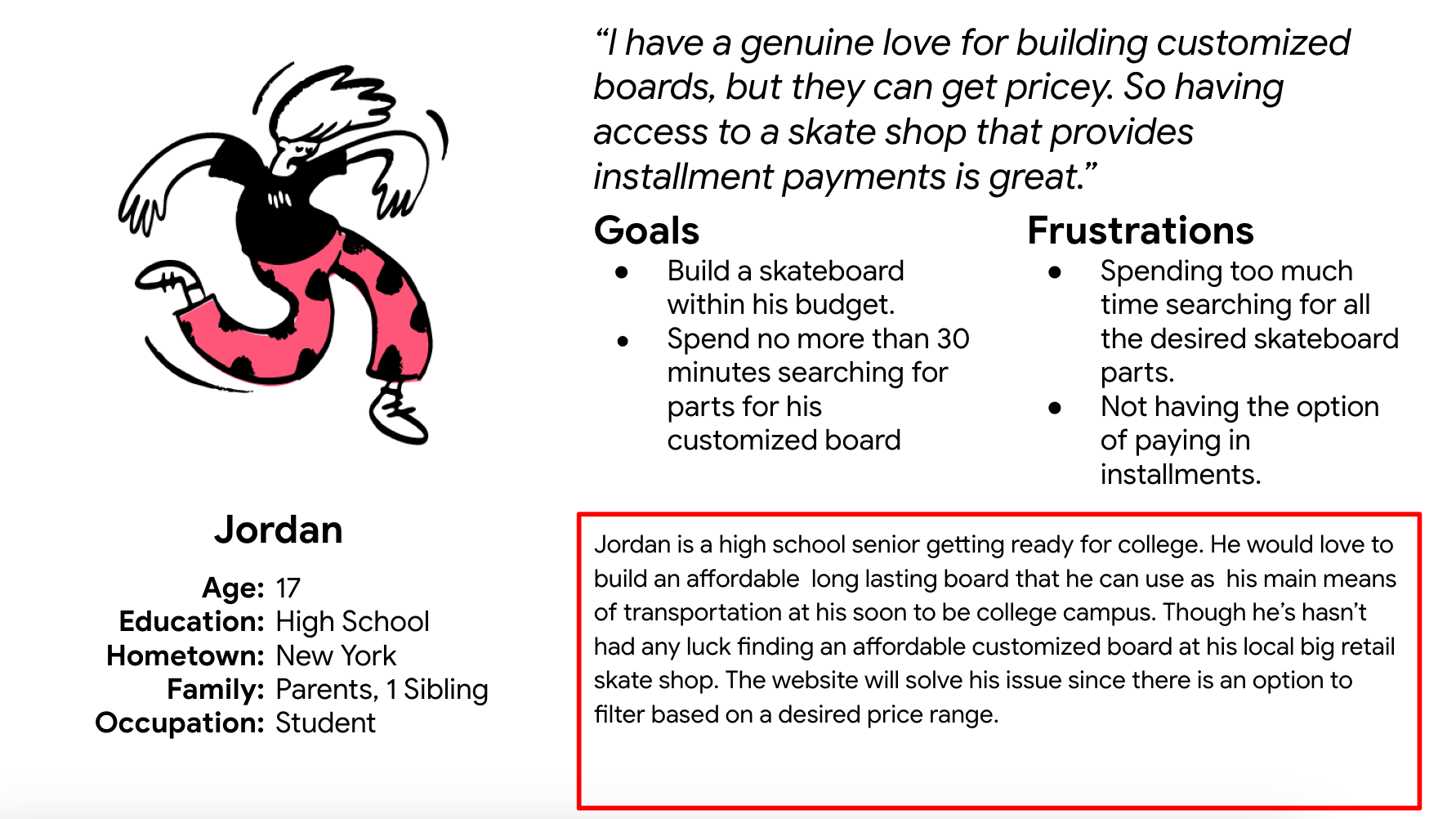
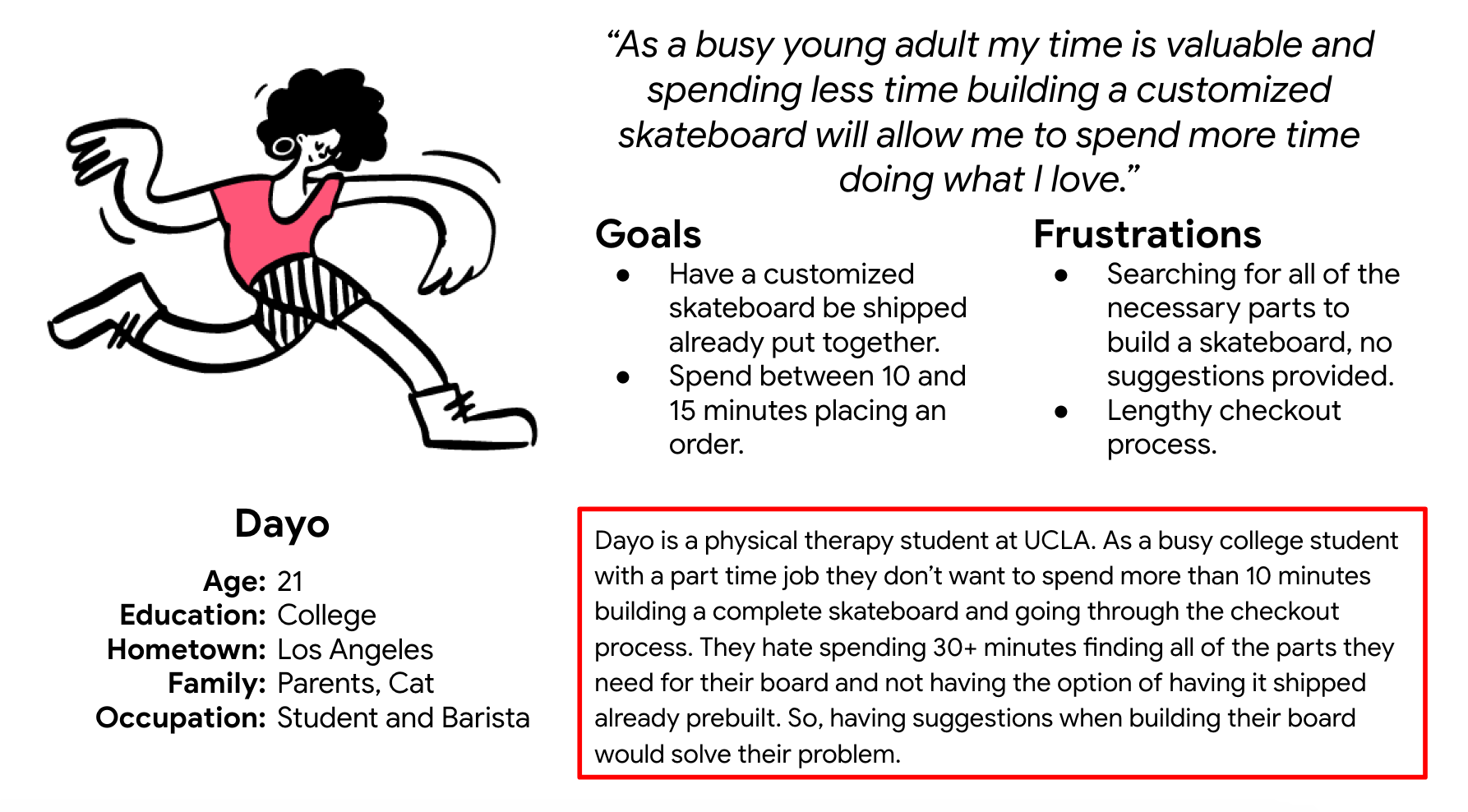
The first focused on diversity, the second on the checkout process, and the third on a search feature.
Lack of diversity.
Lengthy checkout.
Poor quality search results.
Users mentioned there is little to no lgbtq+, poc, or other marginalized groups in the skate world- let alone websites.
Users mentioned that an issue with online shopping is the lengthy checkout process and lack of seamless checkout options.
Users mentioned that searching for desired tends to take longer than preferred.
Ideation
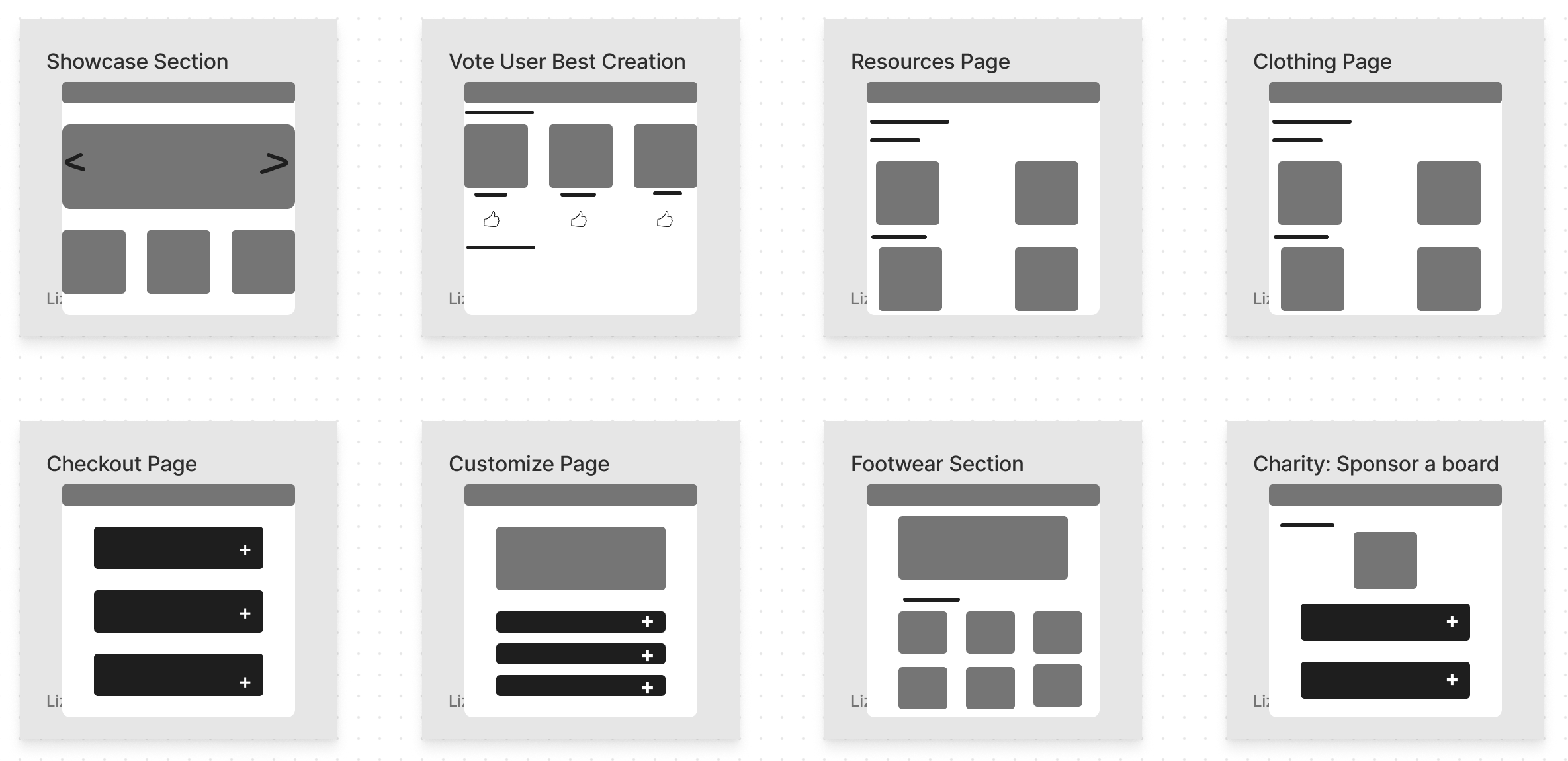
Prior to starting the design process, it's ideal to generate ideas. The purpose of this step is not perfection, but rather a sort of warm up to wire-framing. In this phase I decided to begin with the crazy 8's sprint method followed by the creation of a user flow, and a user journey map.
Crazy 8's
For this project I decided to employ the Crazy 8's design sprint method, which consists of sketching 8 distinct ideas in the span of 8 minutes with the purpose of generating numerous creative ideas without the pressure of perfection looming over.
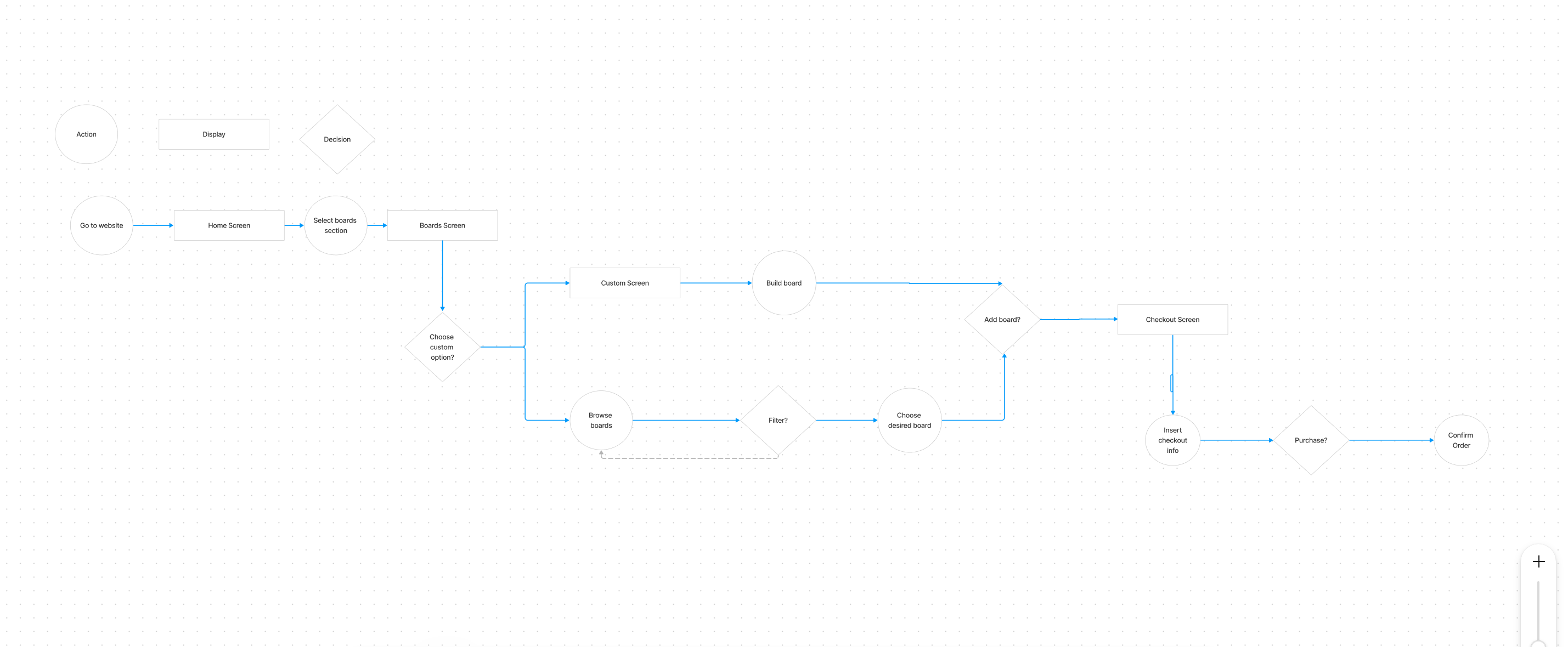
User Flow
The design of the user flow is loosely based on observations of how users interacted with competitor apps, though it's tailored around the features that will be offered by the skate shop. In short, the user flow serves as an outline, early in the design process, with an intuitive path for the user to follow.
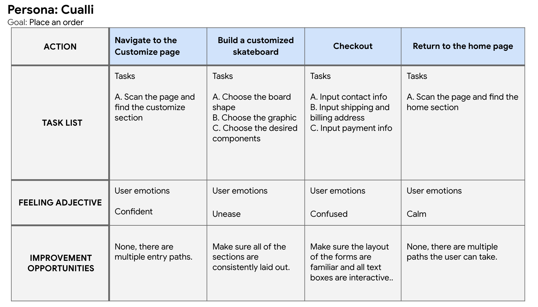
User Journey Map
Due to the fact that the product has yet to been developed, I opted to create a future state user journey map. It provides a design direction with the help of information collected from the user interviews -which were all collected by observing users interact with competitor apps. The future state journey map is a culmination of the initial planning of the design direction for the product- there will be a lot more iterating, since the design phase is the next step in the process.
Design & Evaluation
This section covers a significant portion of the case study, it provides visual examples and design iterations of the product. It is composed of four major sections: the site map, wireframes, prototypes, and a usability study. At the end of the design and evaluation processes the outcome will be a functional user friendly design with room for improvement.
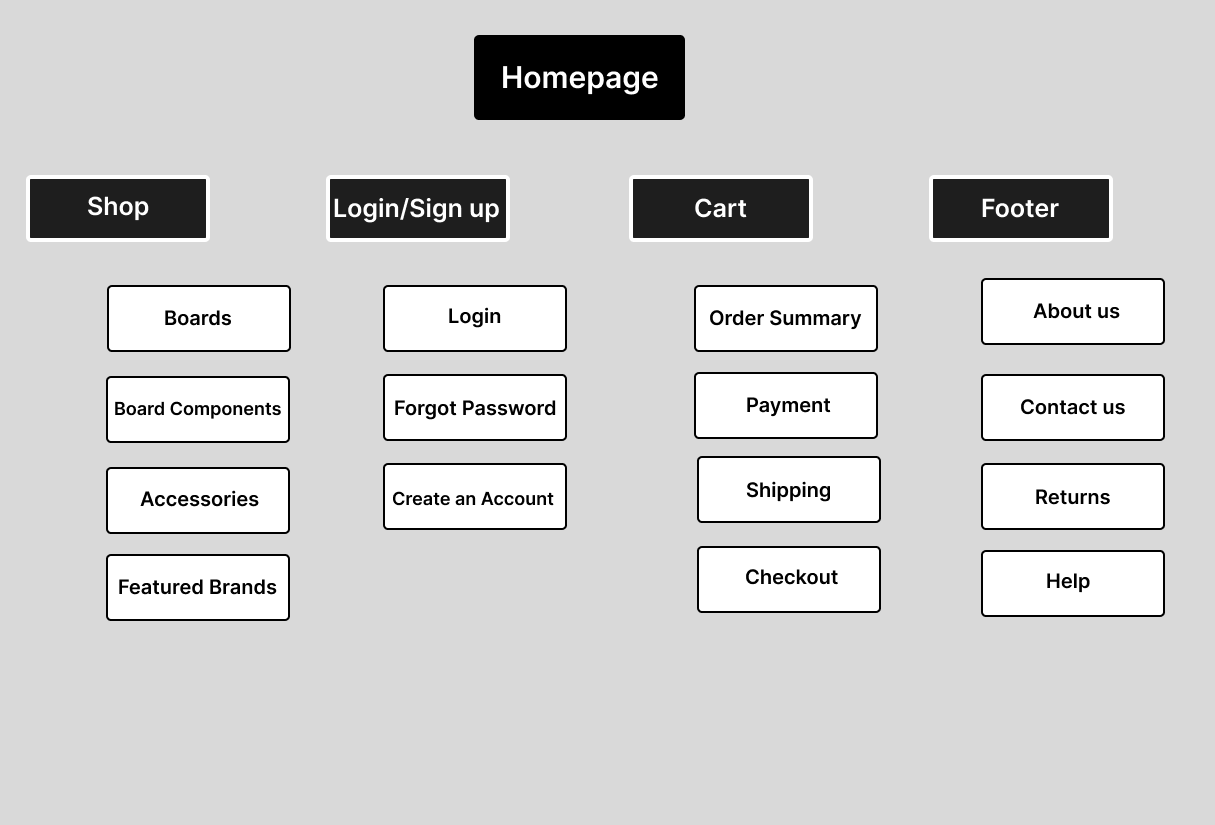
Site Map
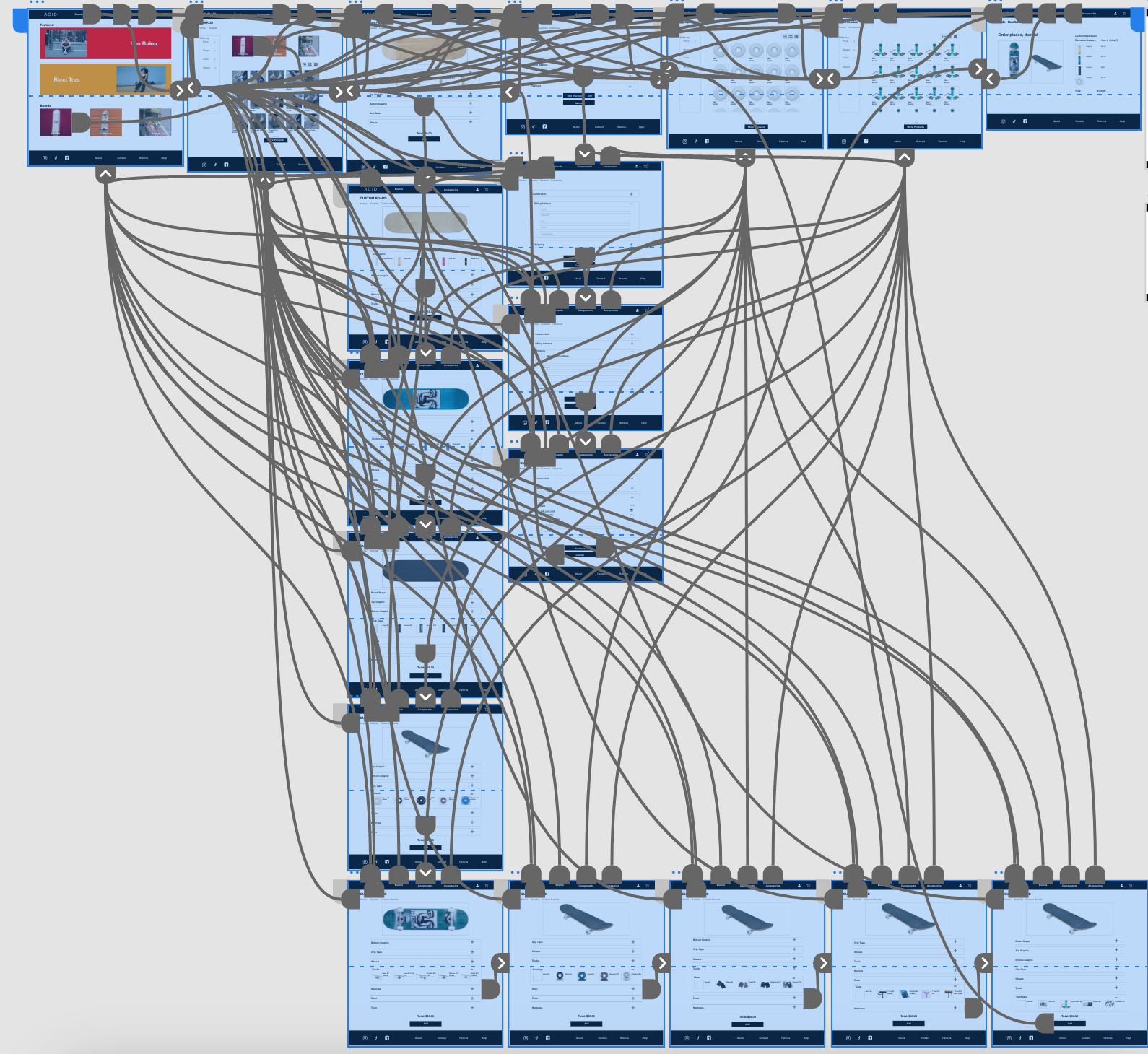
The site map is a way to plan out the information architecture for the website and it helps expedite the design process by informing the wireframes. It's not a fixed entity and will continue to evolve through the design process.
Wireframes & Low Fidelity Prototypes
The items in this section are a great example of designs iterative process. At the start are paper wireframes, which serve as a form of brainstorming and get the design ball rolling. From this, a more refined version is developed, through the design of a lo-fi digital wireframe resulting in a lo-fi prototype. This prototype will be tested resulting in further improvements to the design. Ultimately, the more issues this early on in the design process the better.

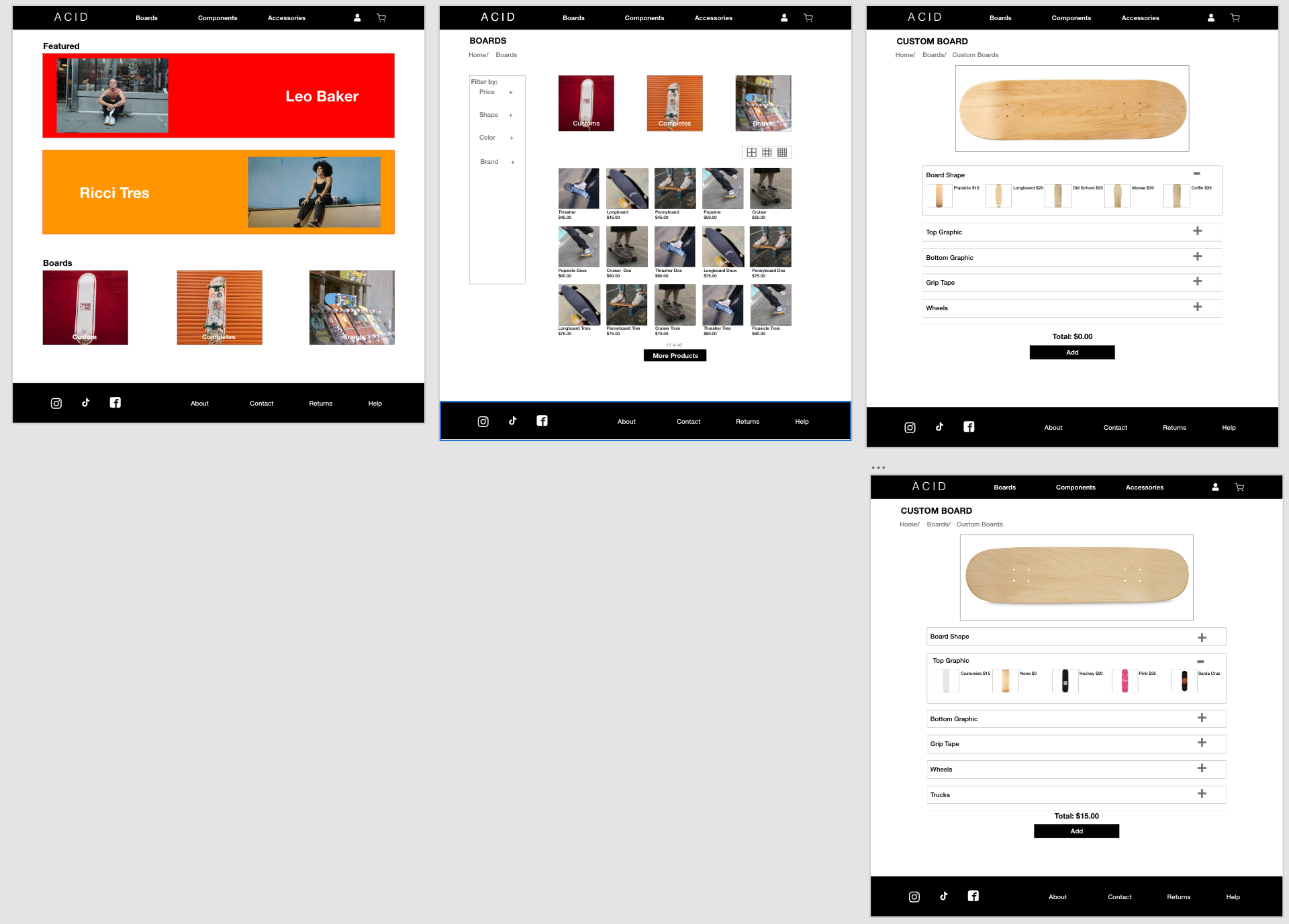
The aim of this wireframe is to address the three user pain points substantiated by the product and user research. Such as, the lack of diversity, the lengthy checkout, and poor quality search results.
For instance, the lack of diversity is addressed by ensuring the Home screen has hero images of diverse skaters. The lengthy checkout is fixed by ensuring that the entire checkout process can be completed on a single screen. While the poor quality search results are dealt by anticipating user needs.
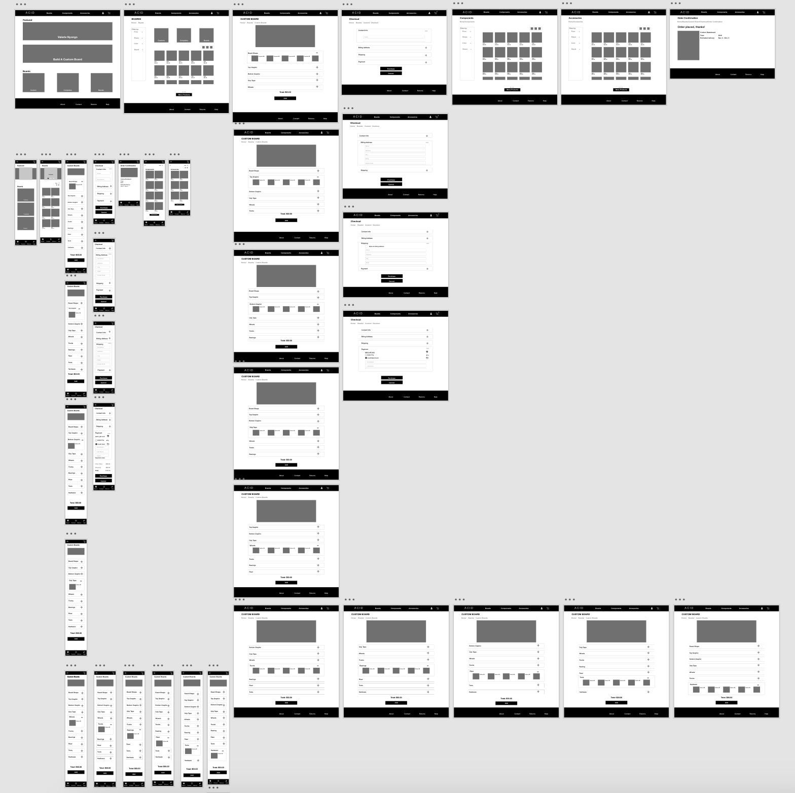 Website LoFi Prototype in Adobe XD
Mobile LoFi Prototype in Adobe XD
Usability Study
This section's focus is on testing and evaluating the design, a very iterative heavy phase. The result is a hi-fi prototype, as similar to a fully functioning product as possible.
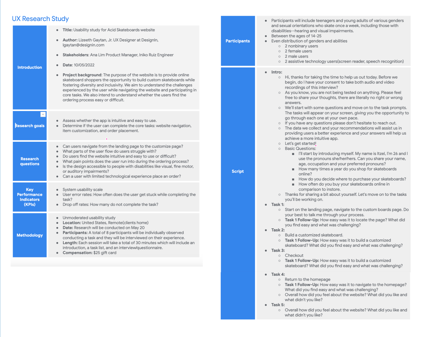
The usability study, is unmoderated, composed of six participants and broken down into the following parts: a usability research study plan, the usability notes, an affinity diagram, the findings, and a brief explanation on the design iteration that resulted from the study.
Creating a research plan prior to conducting usability research is a practice that I find extremely useful. Not only does it help me set research expectations, it also serves as an overview of the study that I can reference back to when needed. Overall, it provides a great starting point from which to begin thinking about the impact your usability research have.
The notes assist in keeping track of the user's experience as they move through the website, while also providing a way to consolidate information that results in useful findings.
Below are just the results for one of the multiple users who were a part of the study.
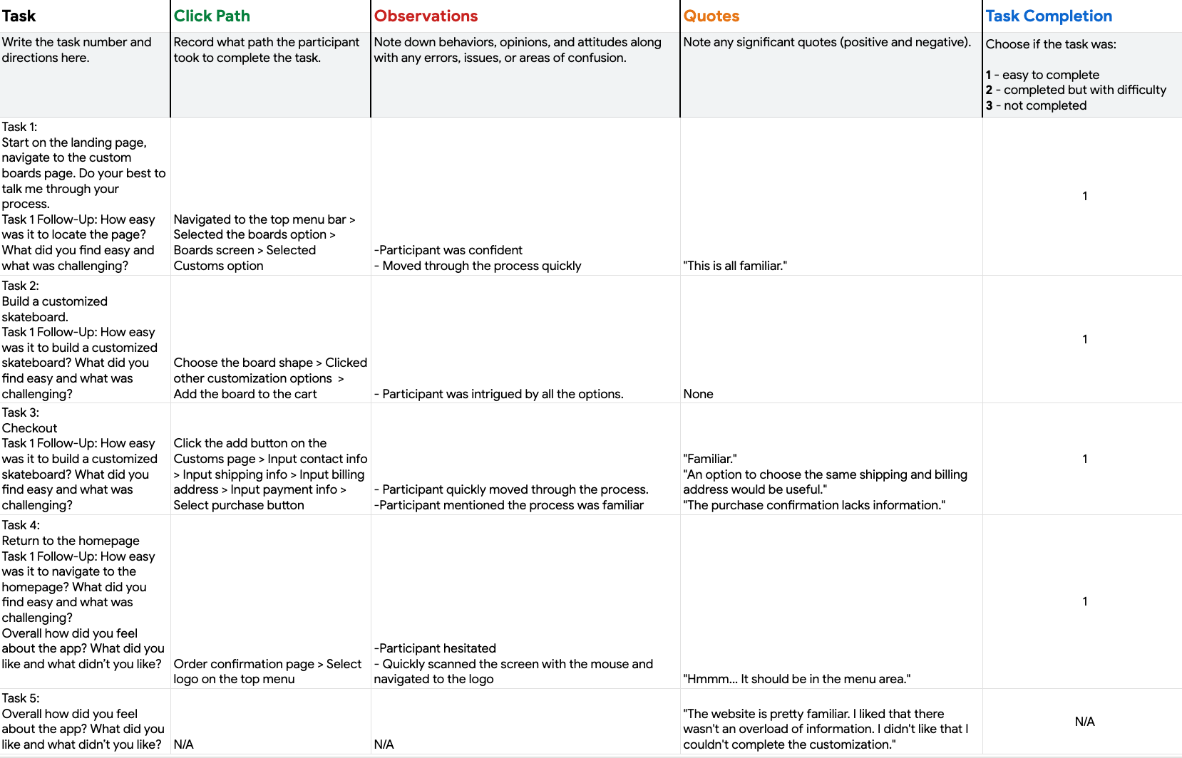 Usability Study Notes
The affinity diagram below consolidates and arranges all of the observations and information gathered from the usability study notes.
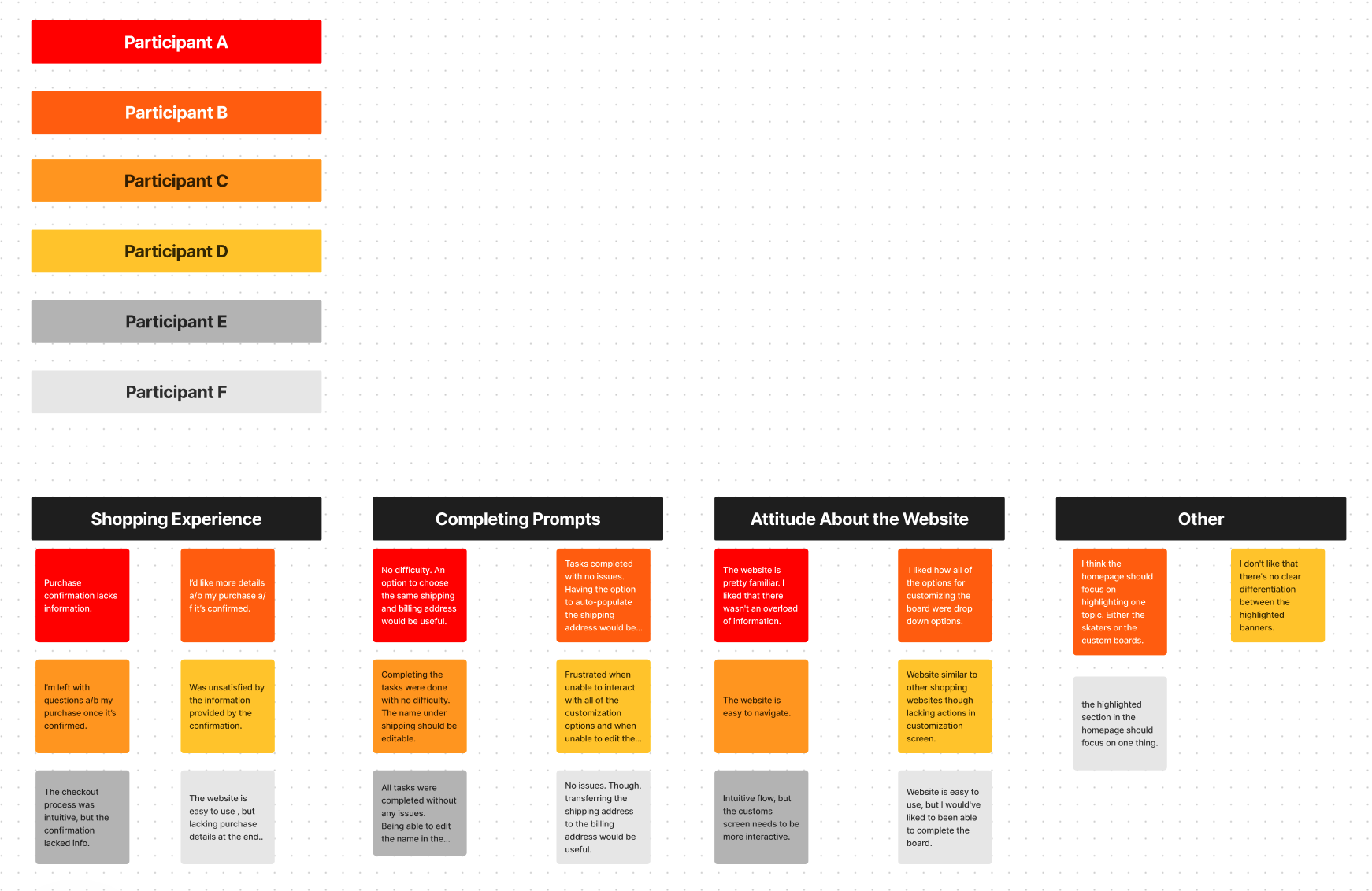
The affinity diagram above was used to identify user patterns and form insights regarding the products usability. Upon analyzing the information, 3 observations below were made.
Confirmation Page: Lack of information.
Home Page: Banners need to have a single focus.
Checkout Page: Unable to edit name in billing section.
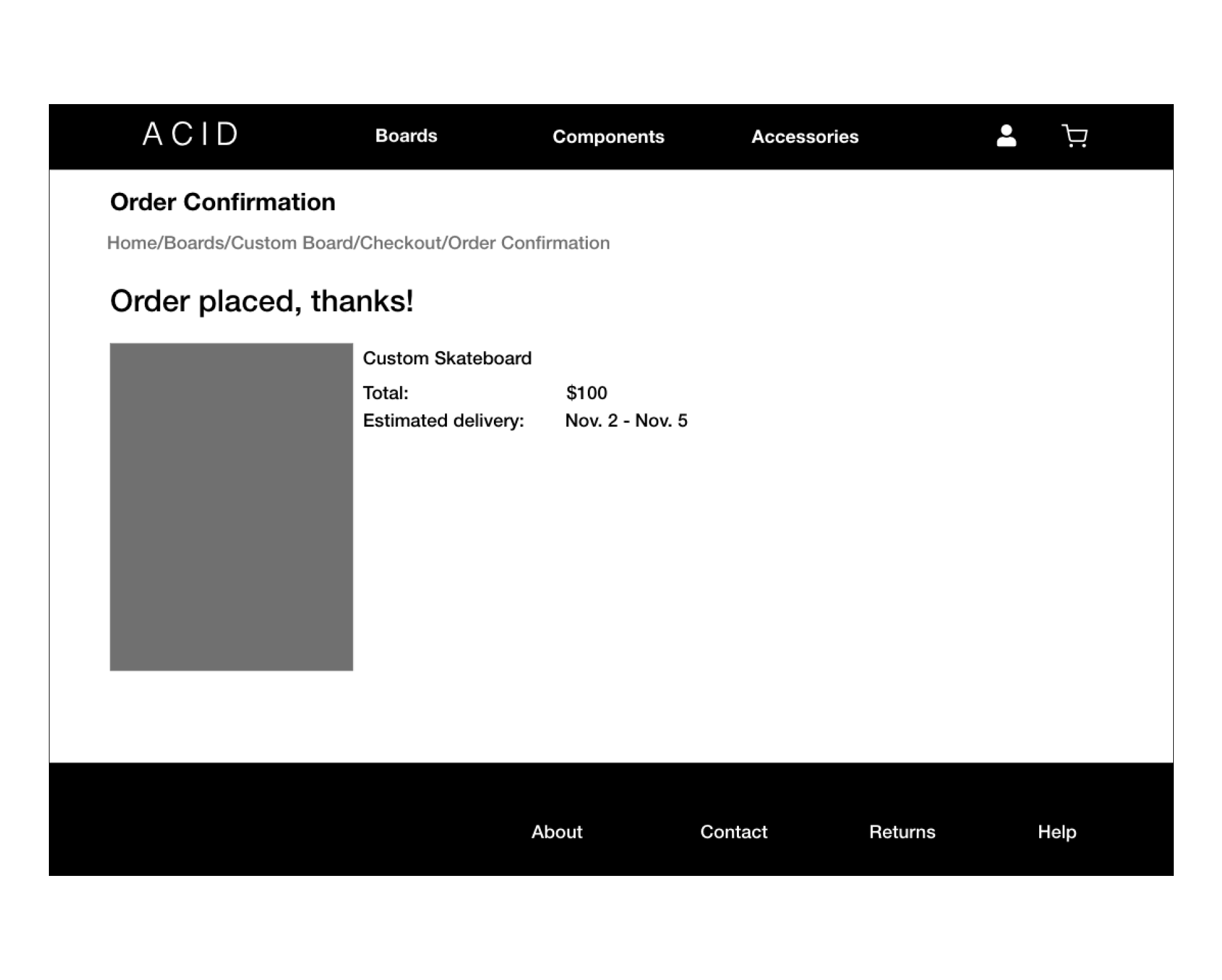
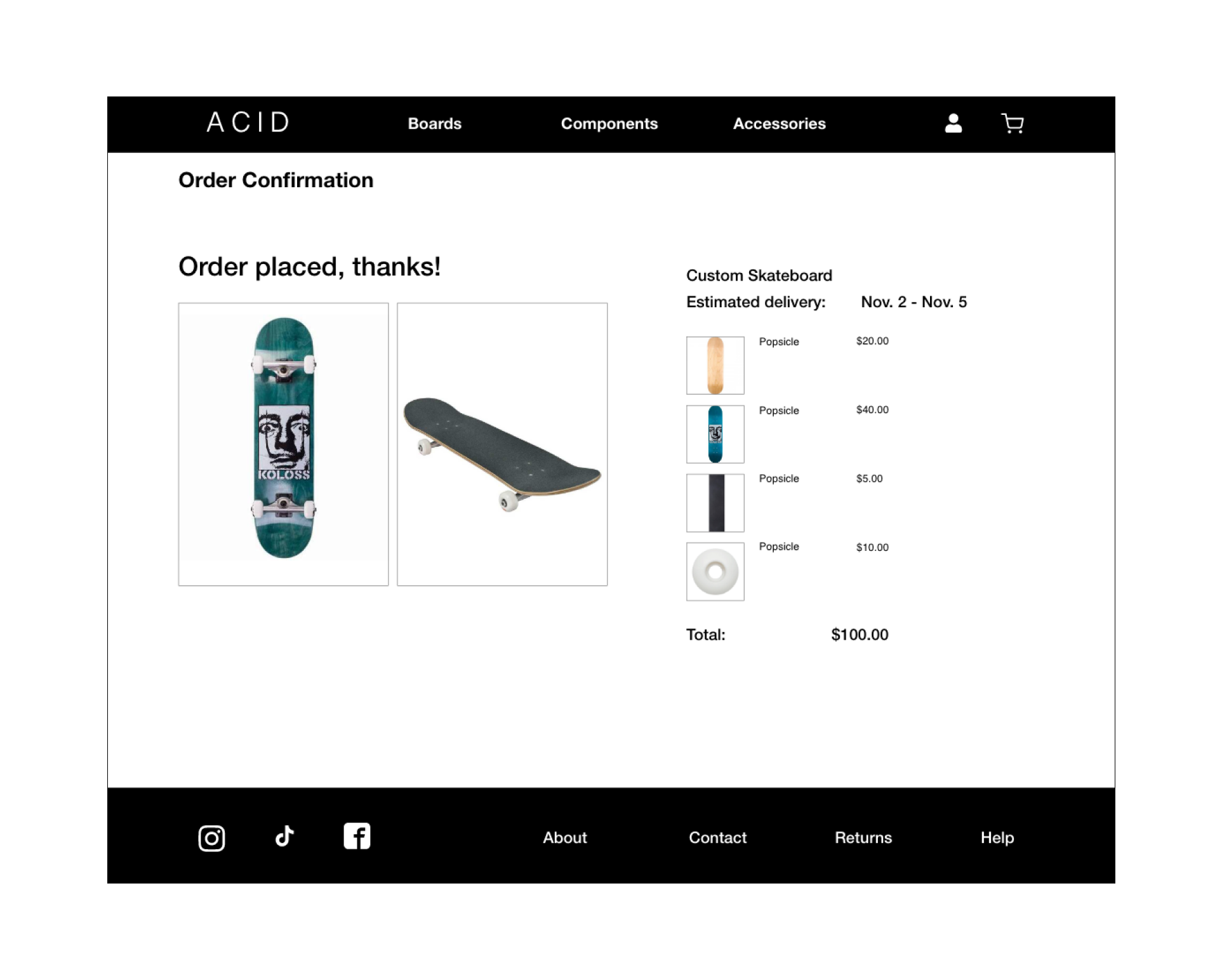
6 out of 6 users mentioned there was a lack of information about the order. The issue could be corrected by ensuring the confirmation screen has all of the product details.
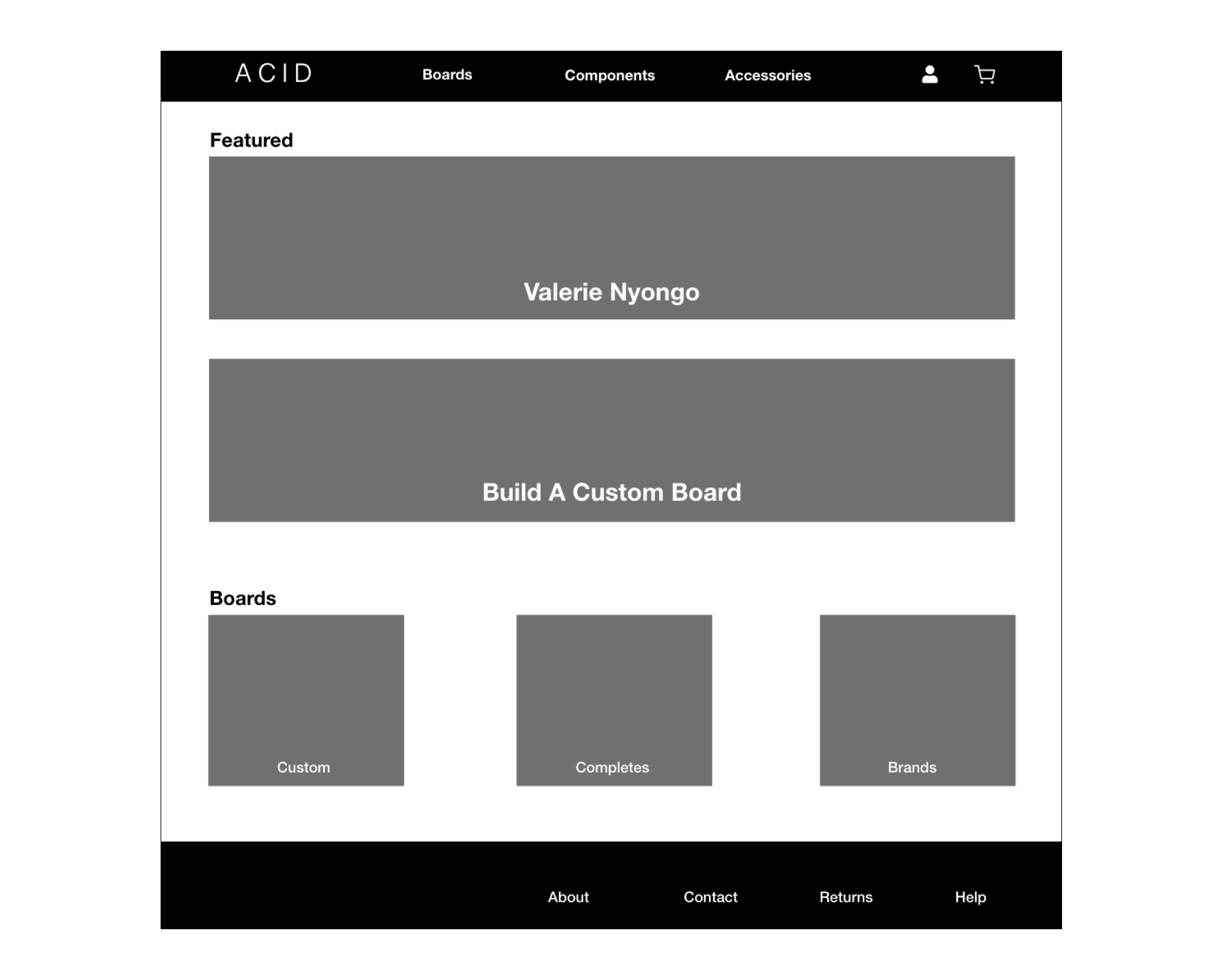
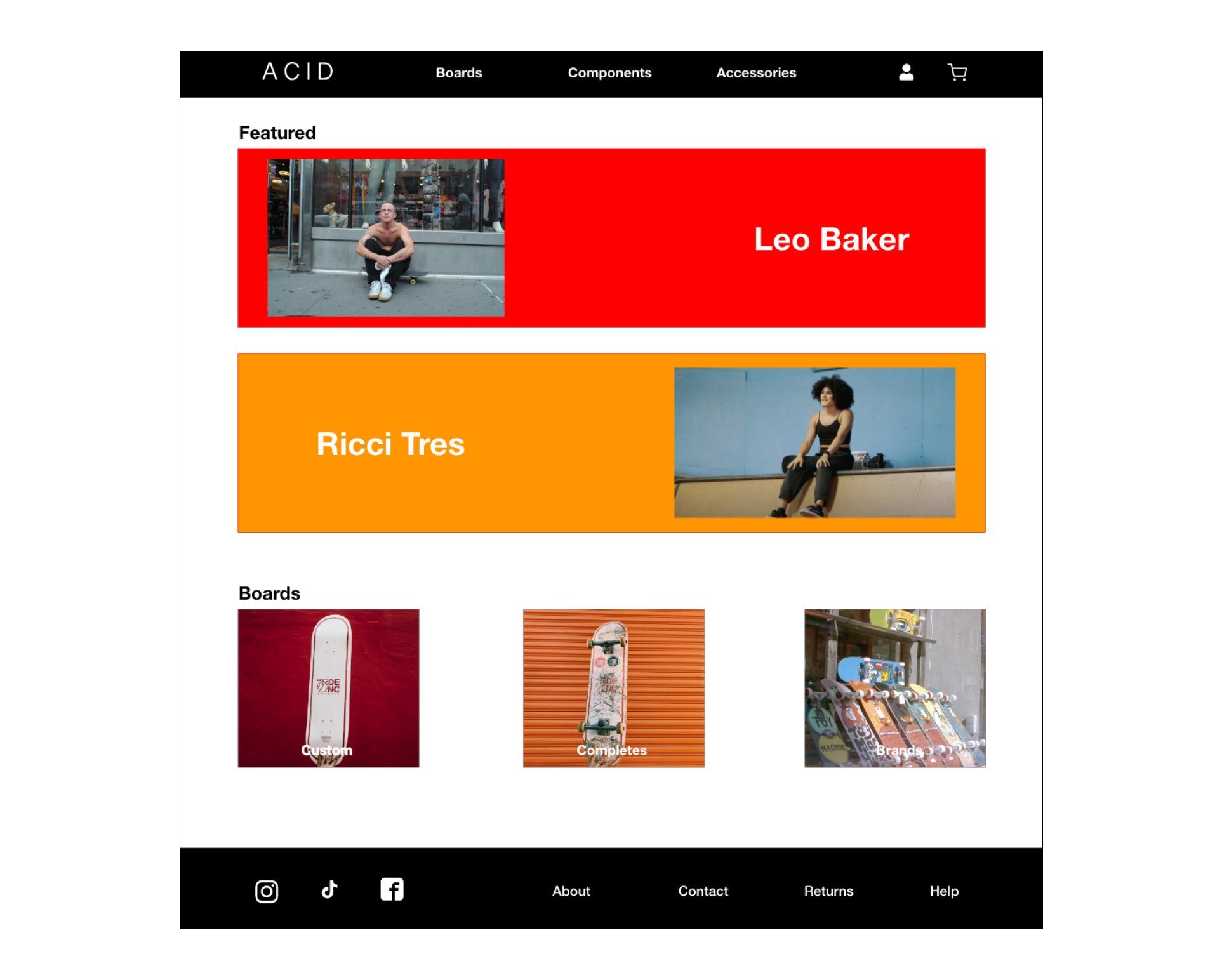
3 out of 6 users mentioned that the banner should emphasize one subject. This means that the banner should be redesigned to either highlight skaters or goods.
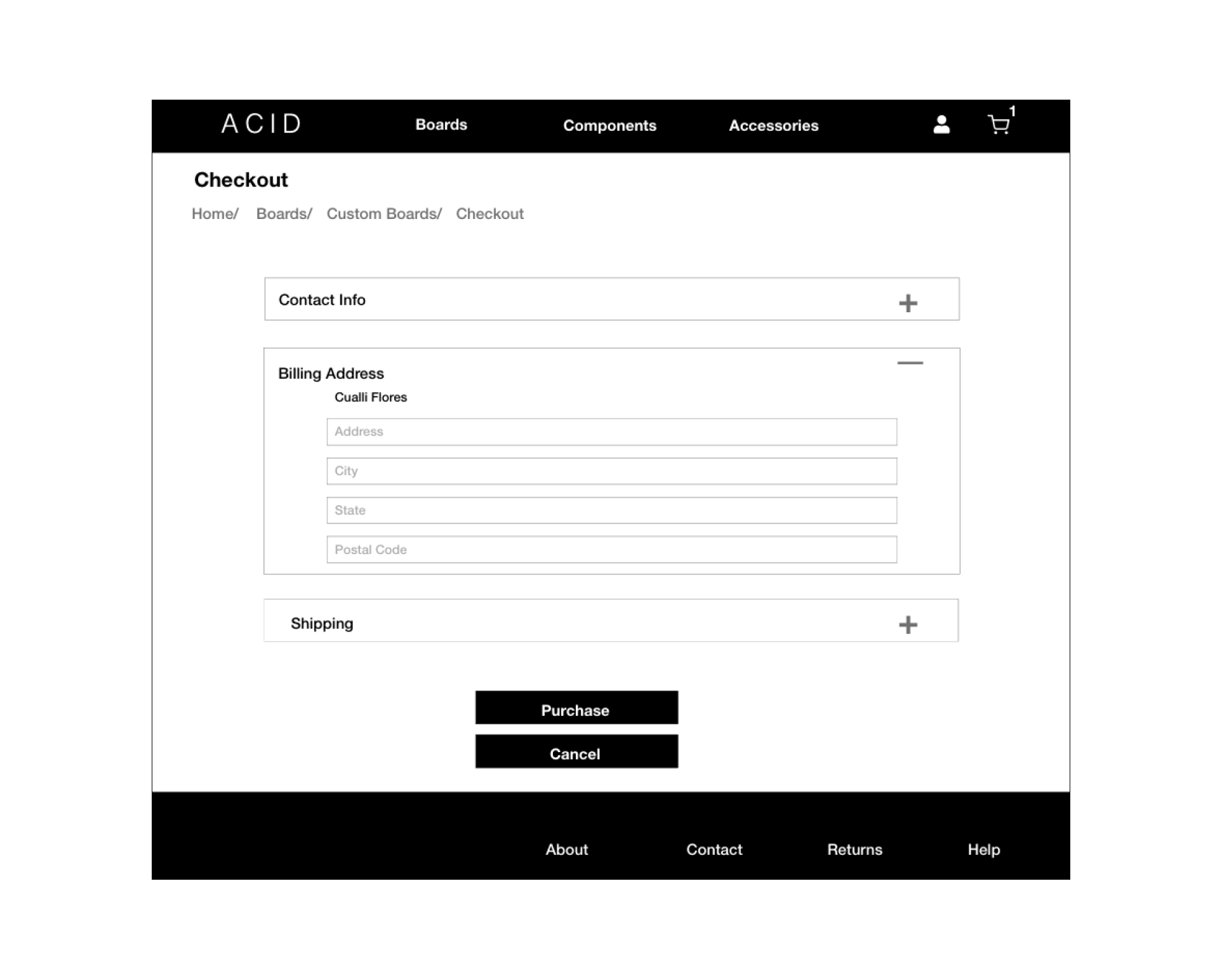
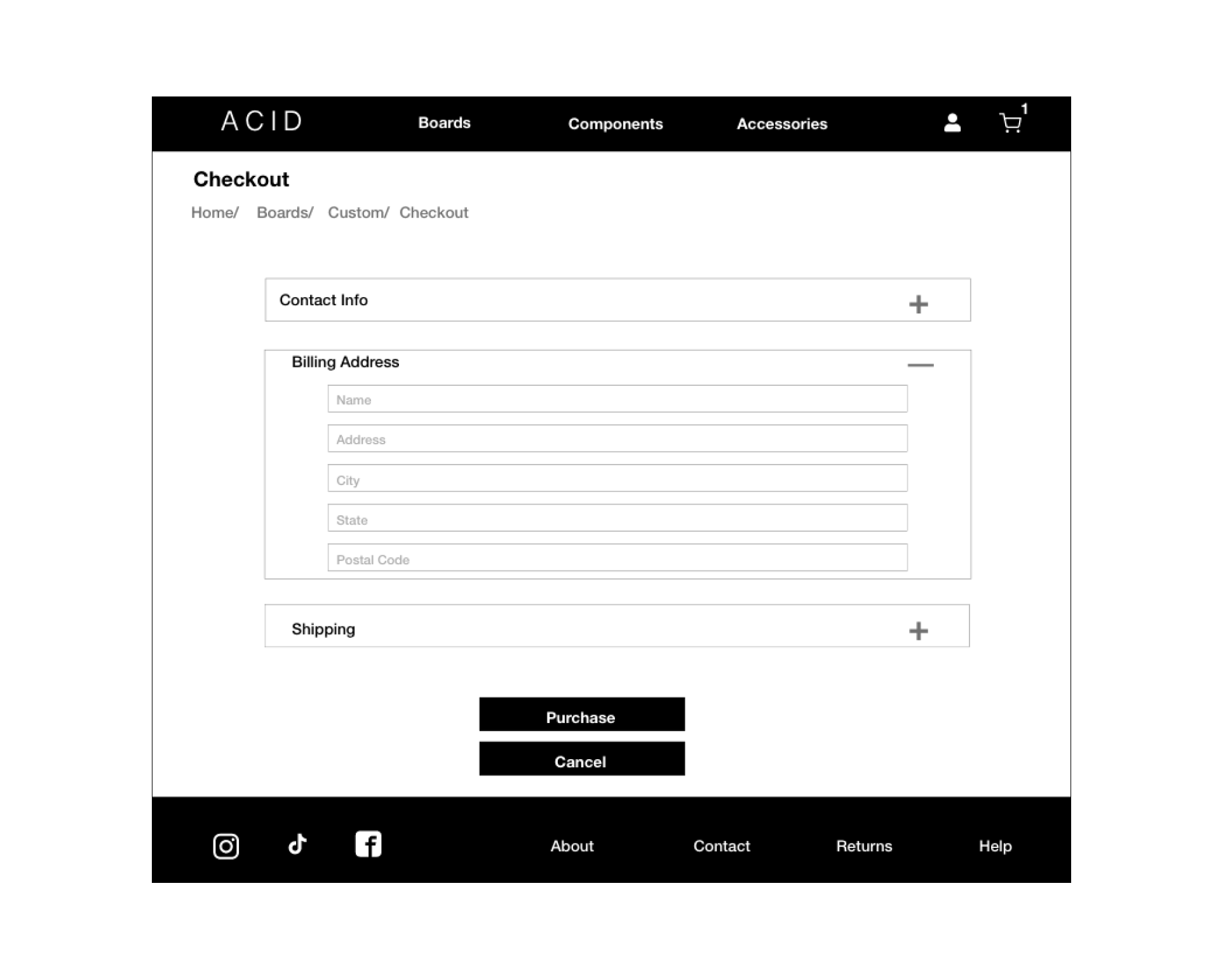
3 out of 6 users viewed being unable to edit the name in the billing section as inconvenient. This issue can be adjusted by ensuring there is a text box as opposed to just a text block.
The first couple of images focused on the lack of information on the confirmation page, this issue was handled by designing a more detailed breakdown of the order (Section 1). Another observation involved the home page's lack of focus, in this case the issue was resolved by highlighting a single subject on the banners (Section 2). The third observation centered the check out screen's auto populated name, this was fixed by adding an editable text box (Section 3).
 hifi website Prototype in adobe xd
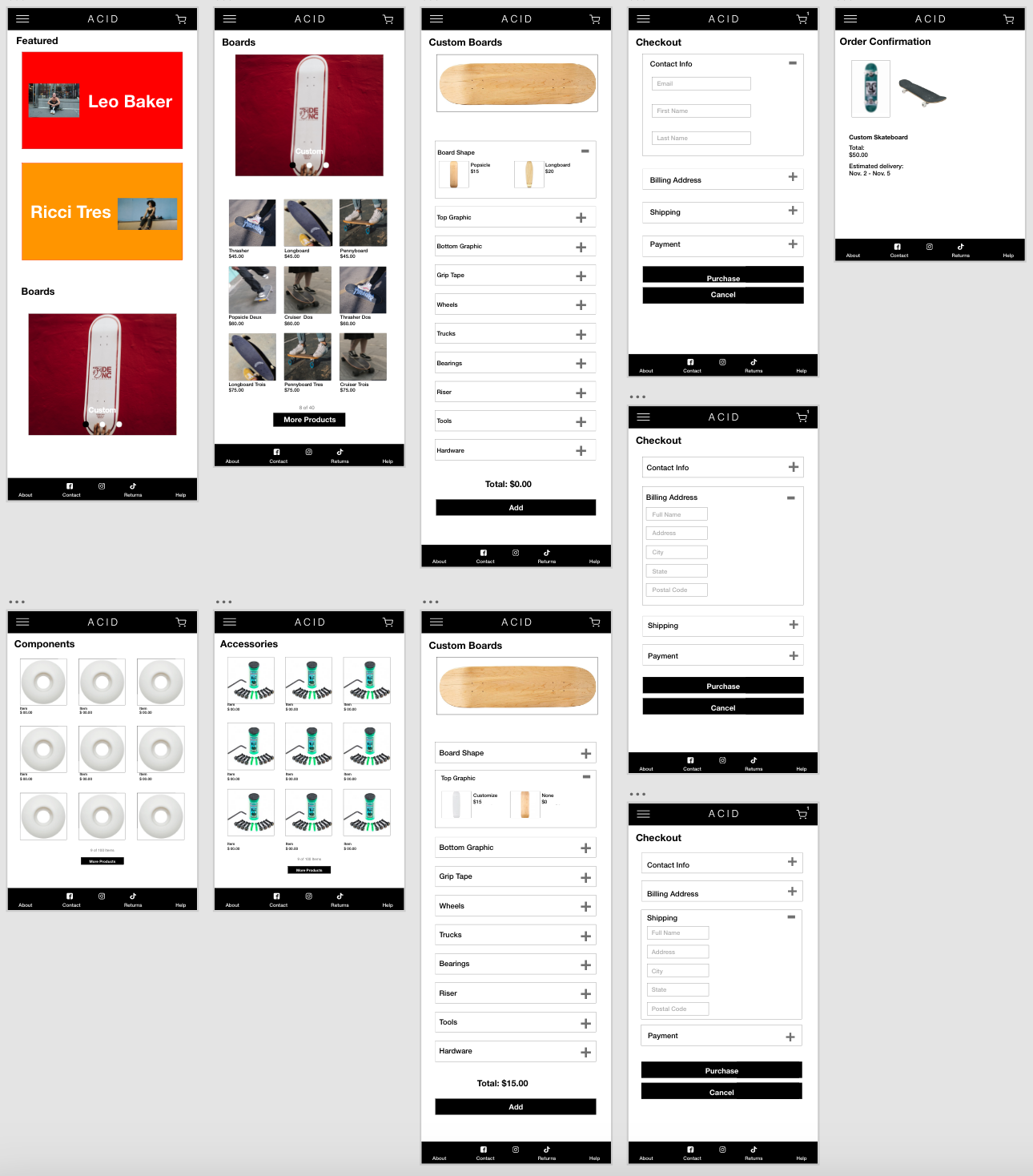
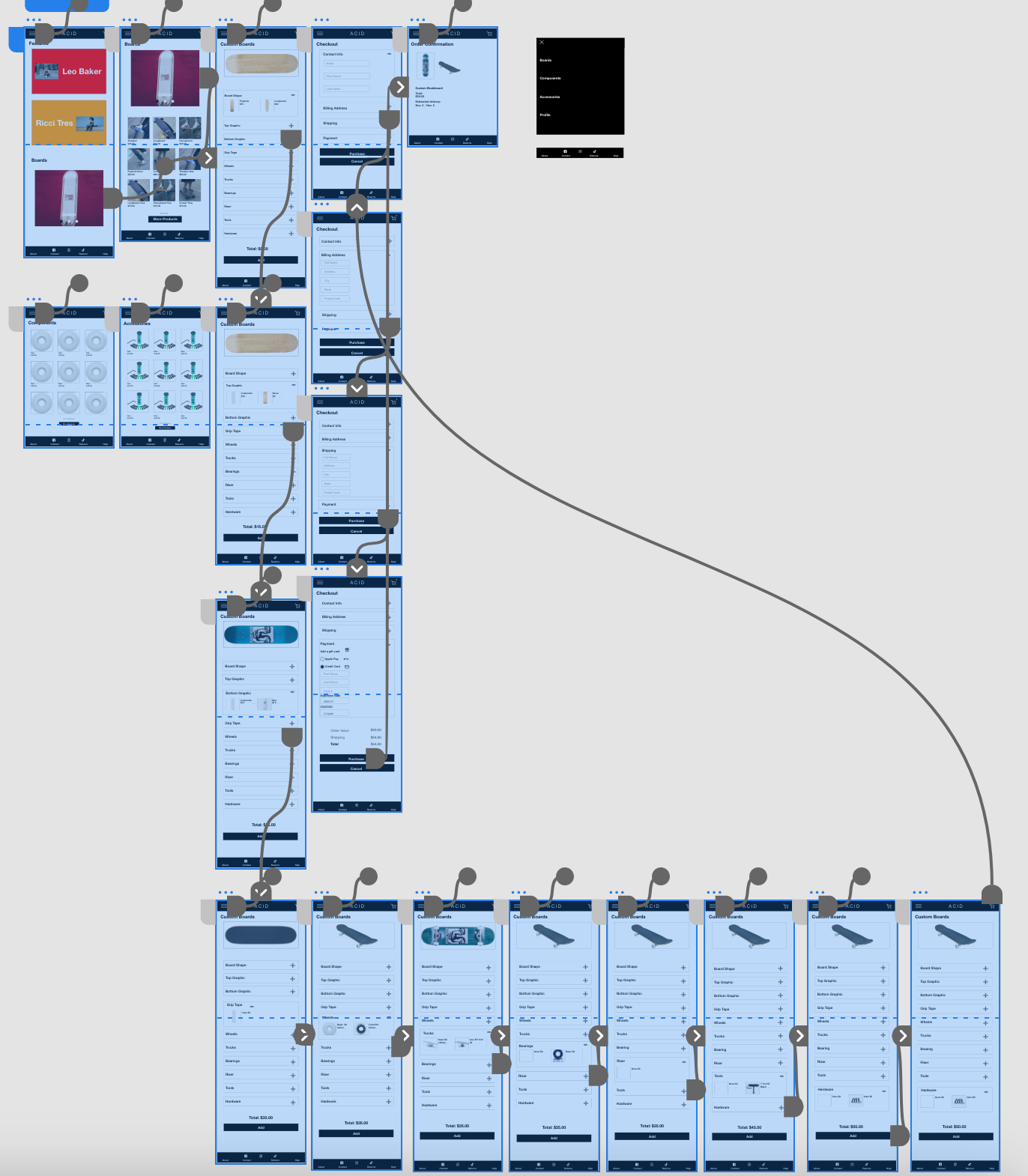 hifi tablet Prototype in Adobe xd
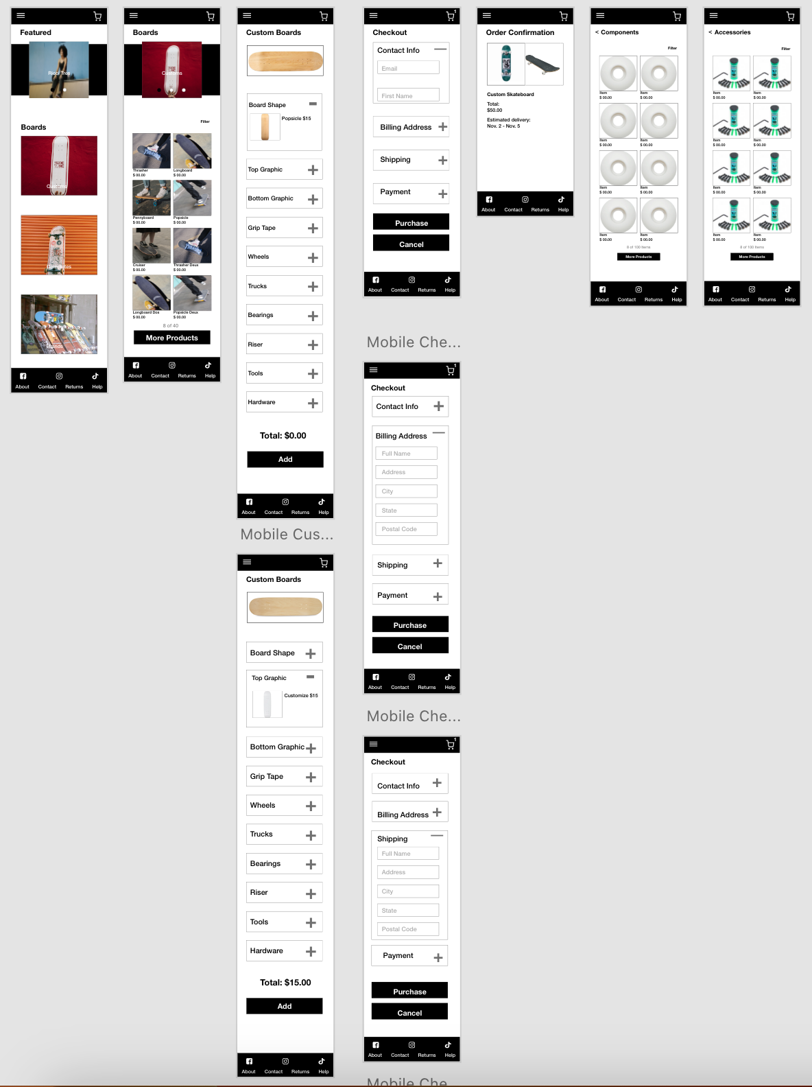
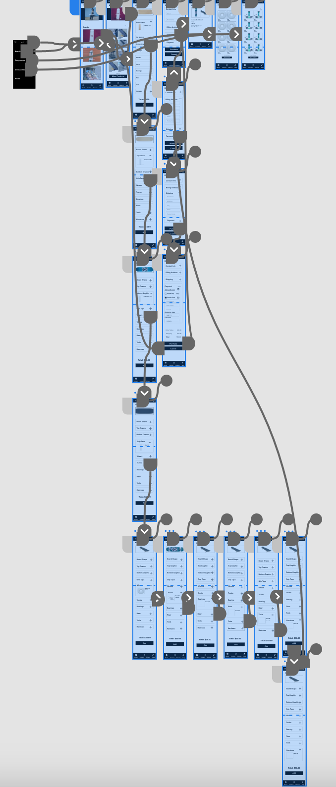 hifi Mobile Prototype in Adobe XD
Conclusion
Final Product
Takeaways
The website's greatest influence is the social impact it will have on the skater community by showcasing underrepresented skaters.
Incorporating user feedback early on is vital to the iterative design process and making changes early on ensures the design process runs smoothly.
"The website's design and navigation was familiar. I really enjoyed learning about skater and how seamless the process of building a skateboard felt."
Next Steps
Run another usability study and examine the user feedback.
Iterate on the design based on user feedback.
Have in mind that user needs are constantly changing and the website's design will be constantly changing and therefore improving.